
Typography
Laying out every word with purpose
Typography shapes how our voice appears on the page. It reflects our warm, empathetic and inspiring tone while supporting clarity and accessibility.
Our type system is designed to flex. It can communicate quietly or boldly, functionally or expressively, while always reinforcing consistency across GE HealthCare’s brand.
Fonts
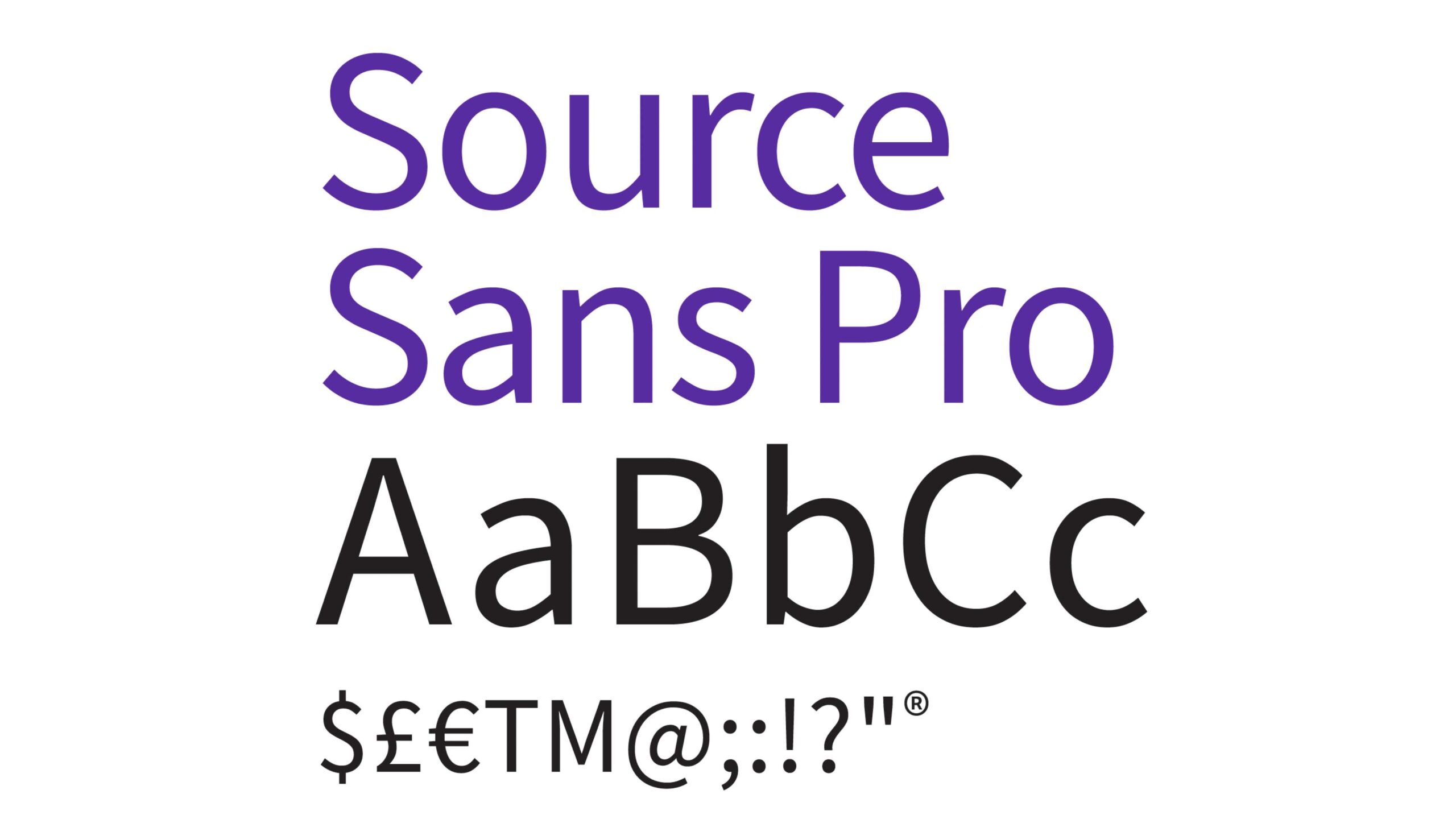
Source Sans Pro
Our primary typeface is Source Sans Pro. Its personality and approachability complement our wordmark while reinforcing clarity and consistency across communications.
As a universal font, Source Sans Pro brings cohesion and compassion to our brand expression worldwide.
It offers broad language support across Latin script, including Western and Eastern European languages, Vietnamese, Pinyin Romanization of Chinese and Navajo.
Source Han Sans
Source Han Sans is the extension of the Source Sans family that includes most Asian languages: Traditional Chinese, Simplified Chinese, Korean, and Japanese.
Please reference the PDx Packaging Guidelines for PDx specific font exceptions.
System font (if Source Sans Pro is unavailable)
In digital applications where access to Source Sans Pro cannot be guaranteed, such as Outlook or email, use the system font Calibri.
Headlines
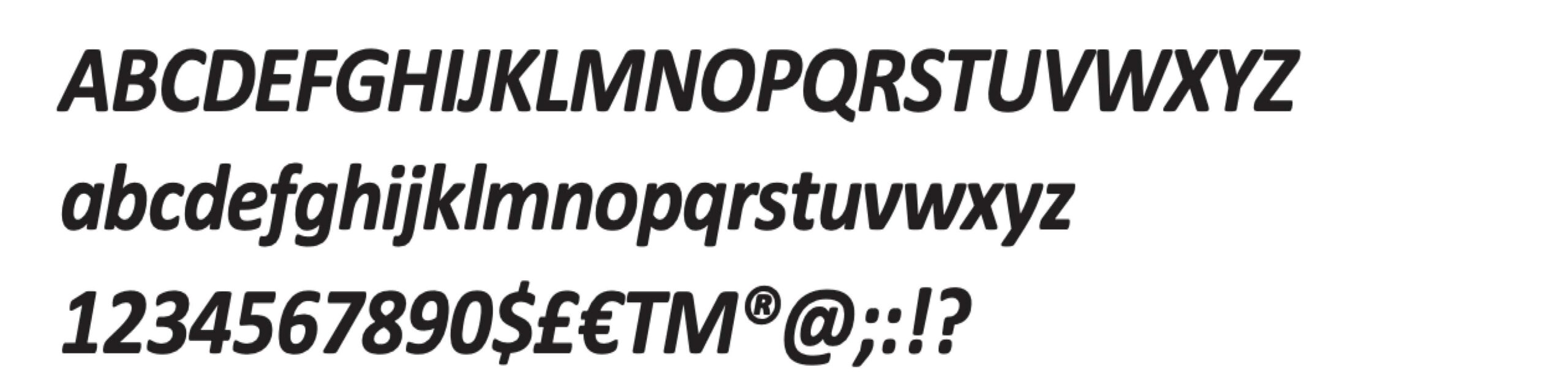
Use Calibri Bold for chapter headers, headlines and subheadlines, as well as for emphasis within body copy. Do not use Bold Italic for headlines.
Body copy
Use Calibri Regular for body copy, captions and quotes.
Italics, Bold and Bold Italic
Use these styles sparingly and only when emphasis is necessary.
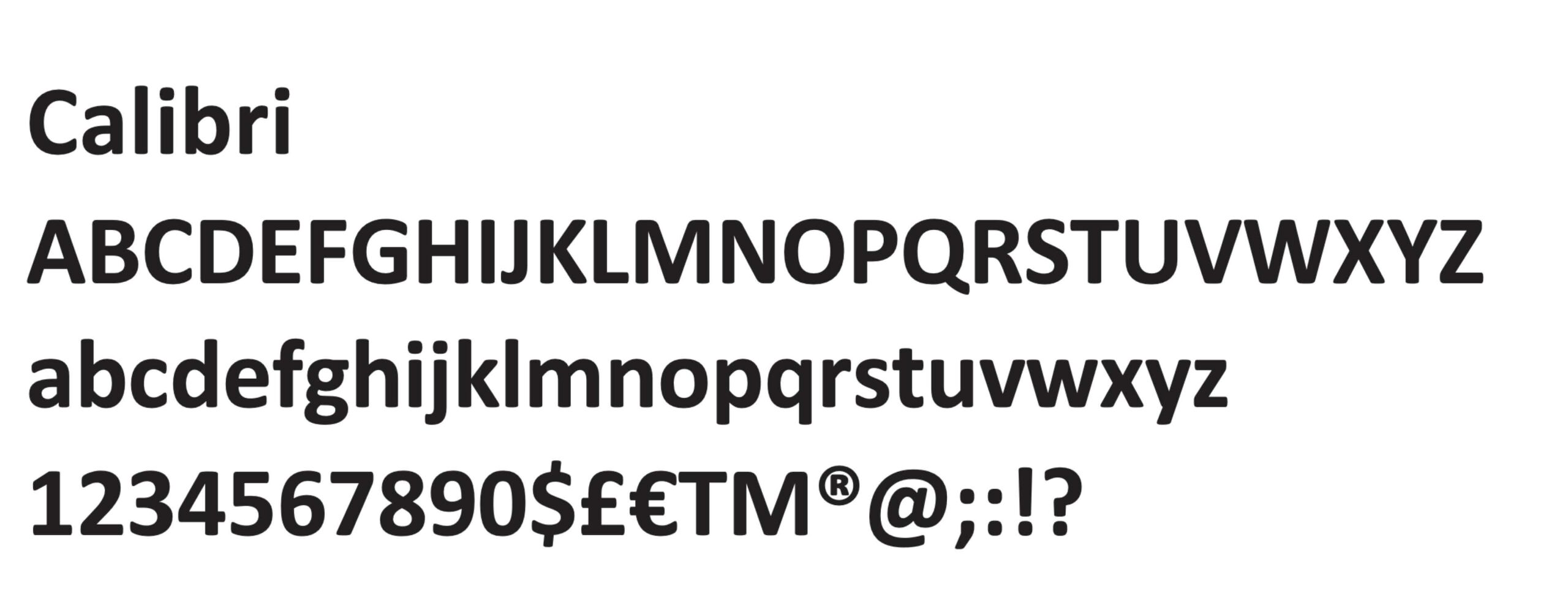
Calibri Regular
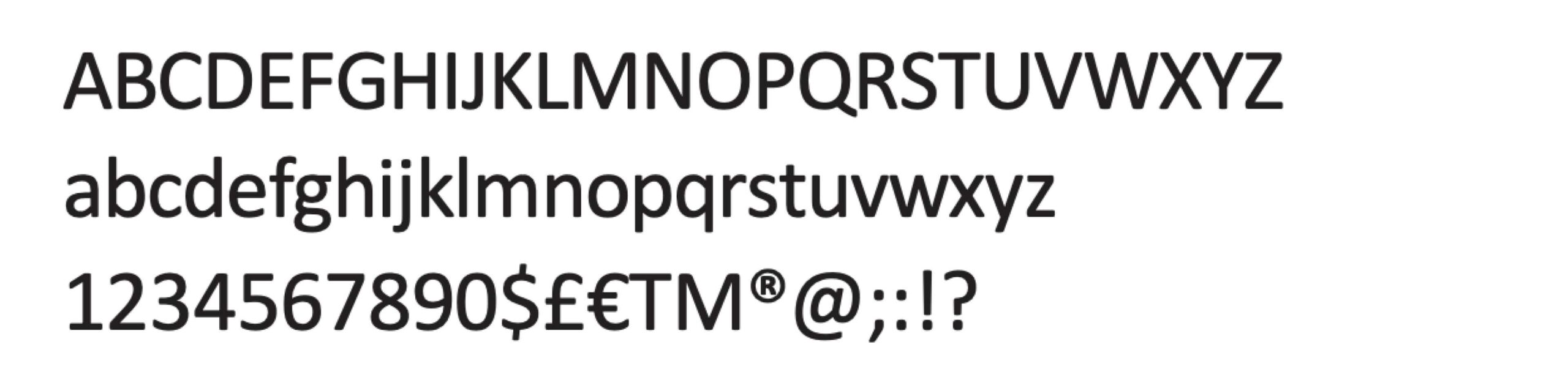
Calibri Italic
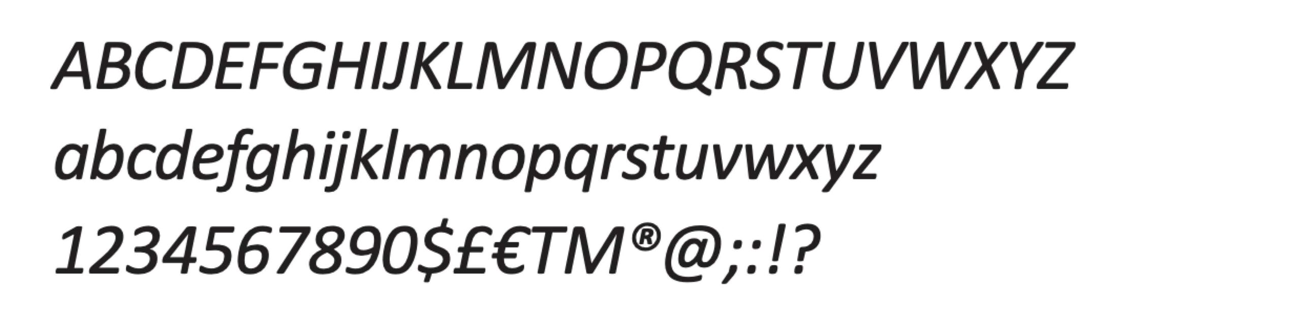
Calibri Bold
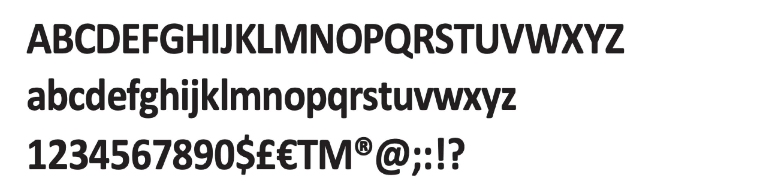
Calibri Bold Italic
Styles
Type styles
Headlines
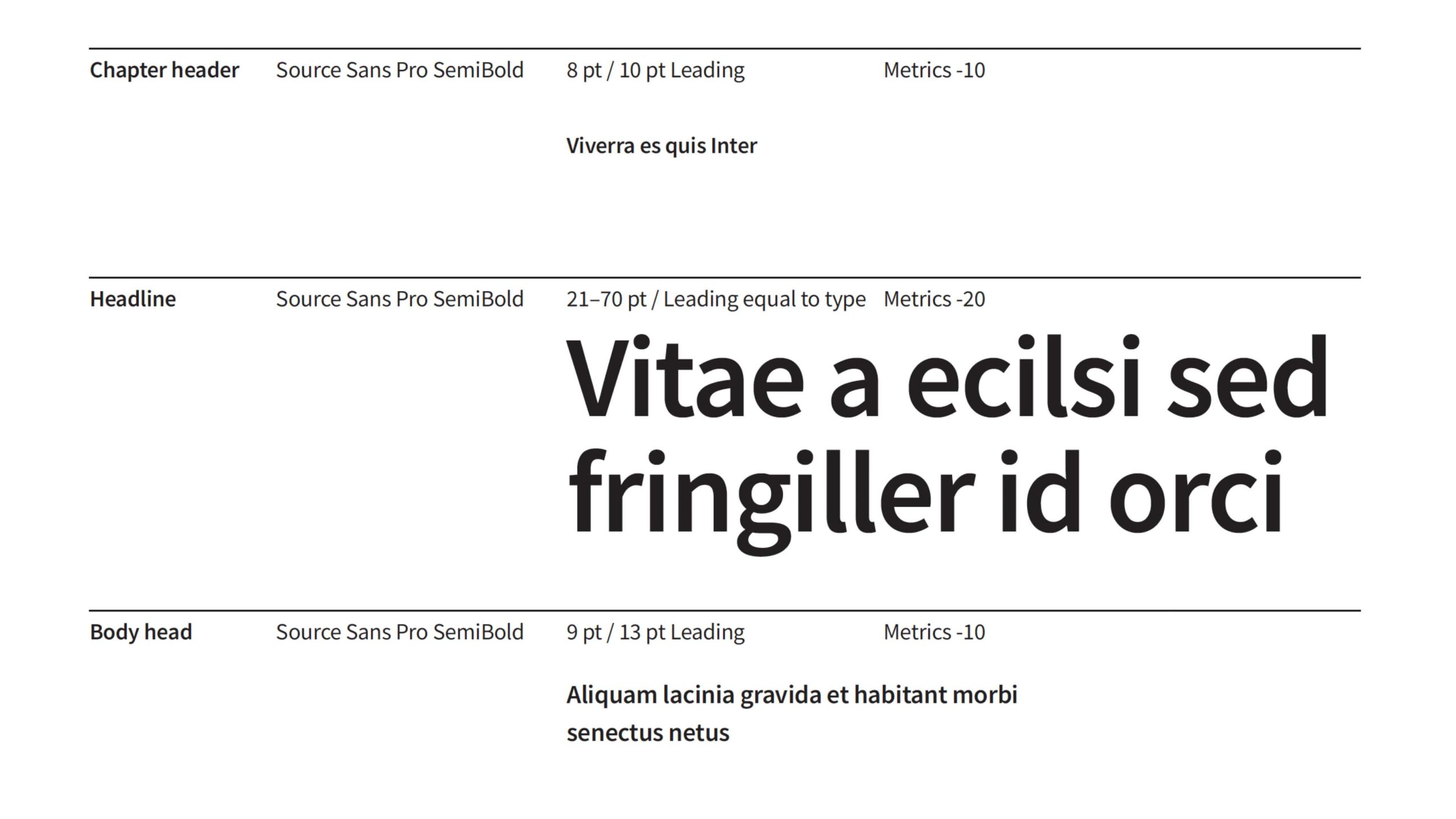
Use Source Sans Pro SemiBold for chapter headers, headlines and subheadlines, as well as for emphasis within body copy, set in sentence case (the first letter of the first word is capitalized, and all other letters and words that follow are in lowercase, except for proper nouns.
Set tracking to “Metrics” -20 for headlines and subheadlines. Do not use SemiBold Italic for headlines.
Body copy
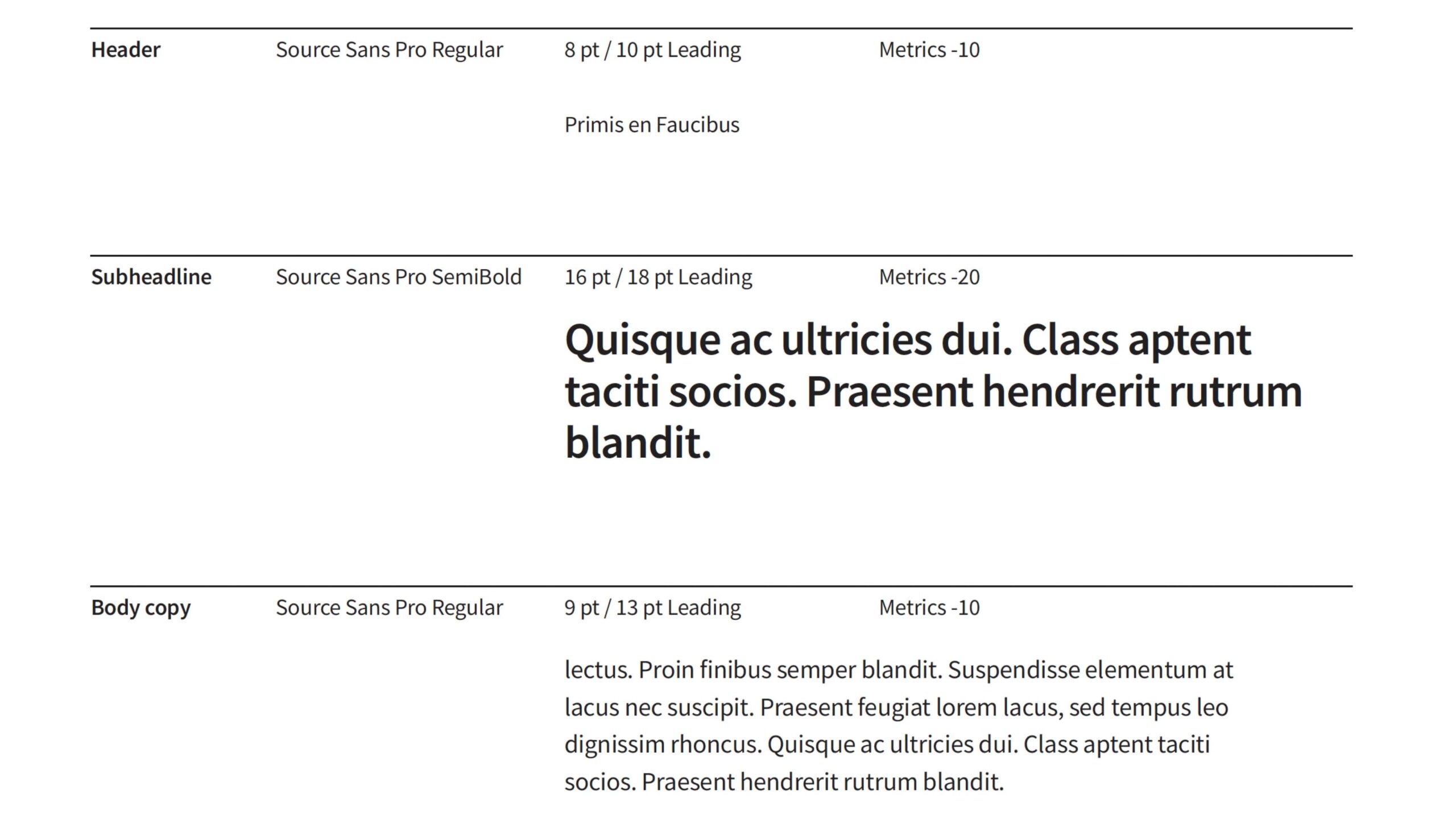
Use Source Sans Pro Regular for body copy, captions and quotes. Set tracking to “Metrics” -10. Use Italic, SemiBold and SemiBold Italic sparingly and only when emphasis is necessary.
Note
These tracking guidelines apply to Adobe products. Other applications may use different settings, so adjust to match the intended visual appearance
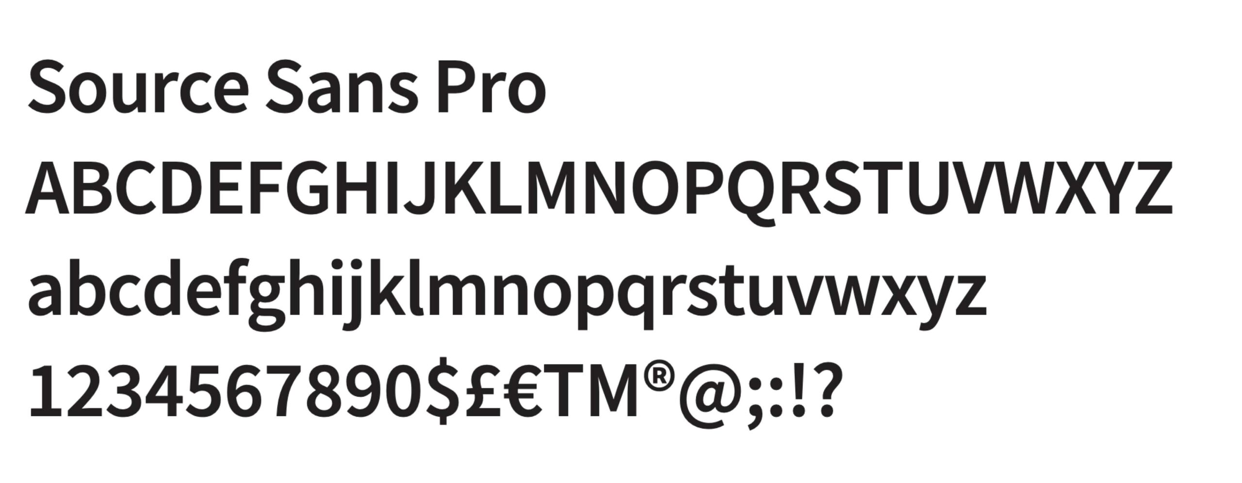
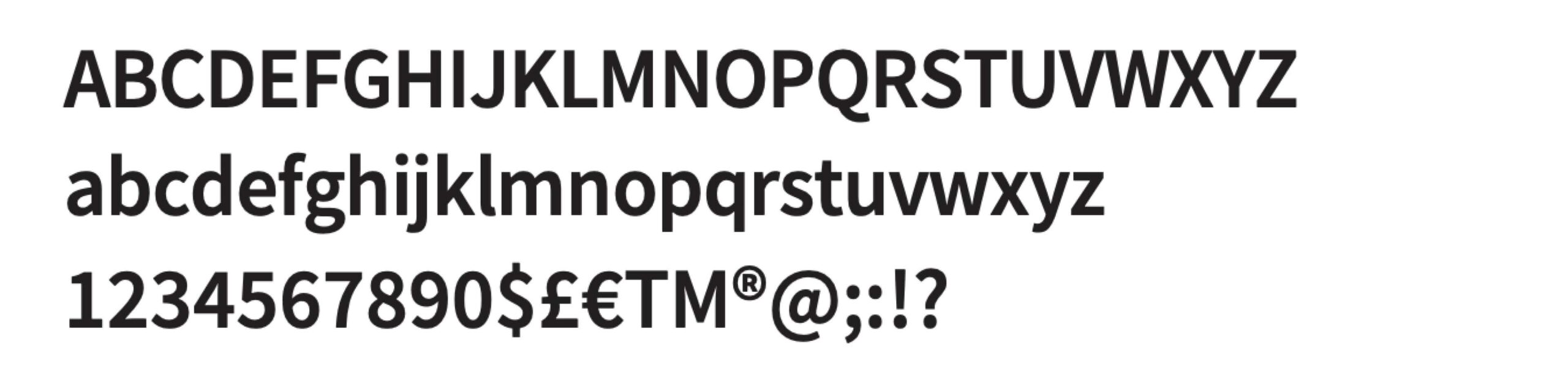
Source Sans Pro Regular
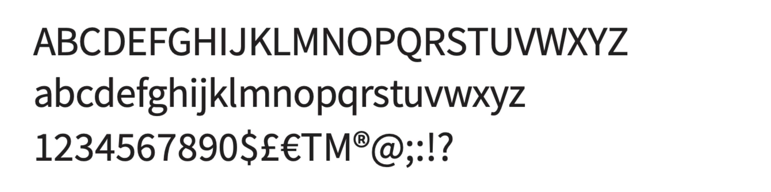
Source Sans Pro SemiBold
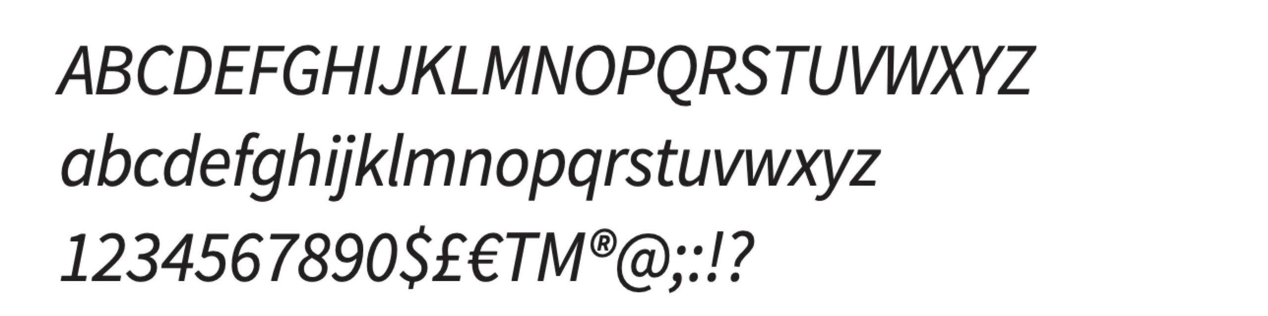
Source Sans Pro Italic
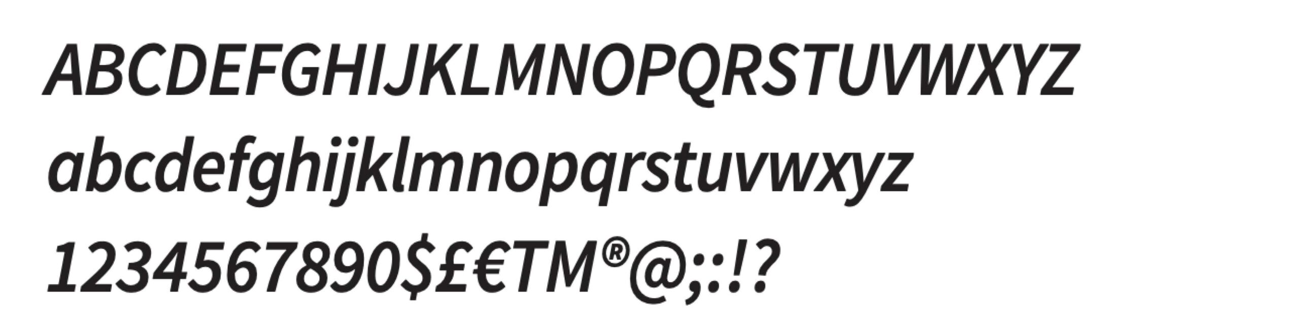
Source Sans Pro SemiBold Italic
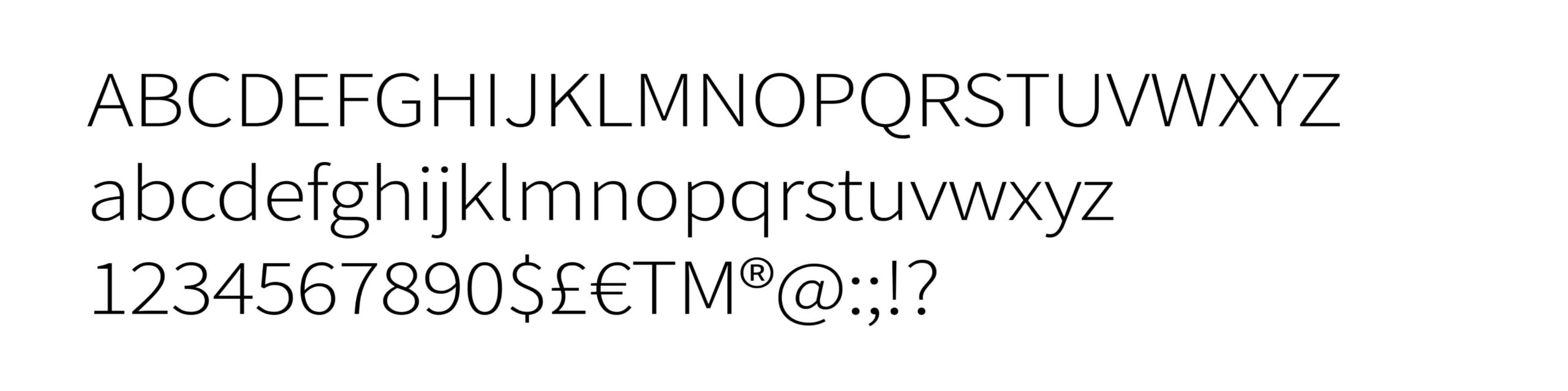
Source Sans Pro Light
Type hierarchy
We use a systematic approach to type sizes and weights to create clear visual hierarchy across communications. Using 9 pt as the base size for body copy, scale type up for headlines and subheadlines and down for captions.
Set tracking to “Metrics” for all type. Use -20 for headlines and subheadlines and -10 for all other text.
Note
These tracking guidelines apply to Adobe products. Other applications may use different settings, so adjust to match the intended visual appearance.
Type hierarchy in use
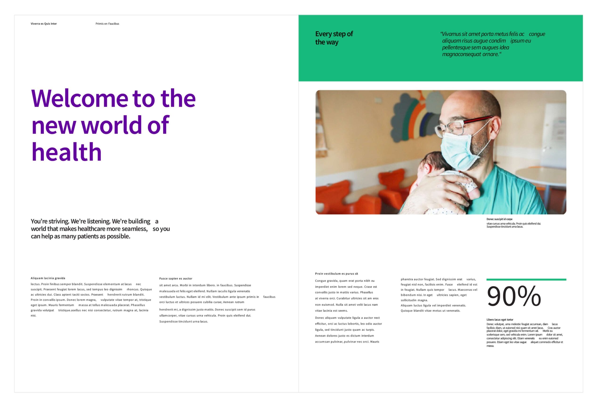
The reference example shows type hierarchy and composition. It demonstrates how to apply the system to create engaging layouts with clarity and consistency across brand communications.
Set headlines in SemiBold to capture attention. Headlines may span two or three lines depending on the layout, with sufficient space around them to support readability. Use sentence case and do not include end punctuation. Use italics sparingly and only when emphasis is necessary.
Left align all copy.
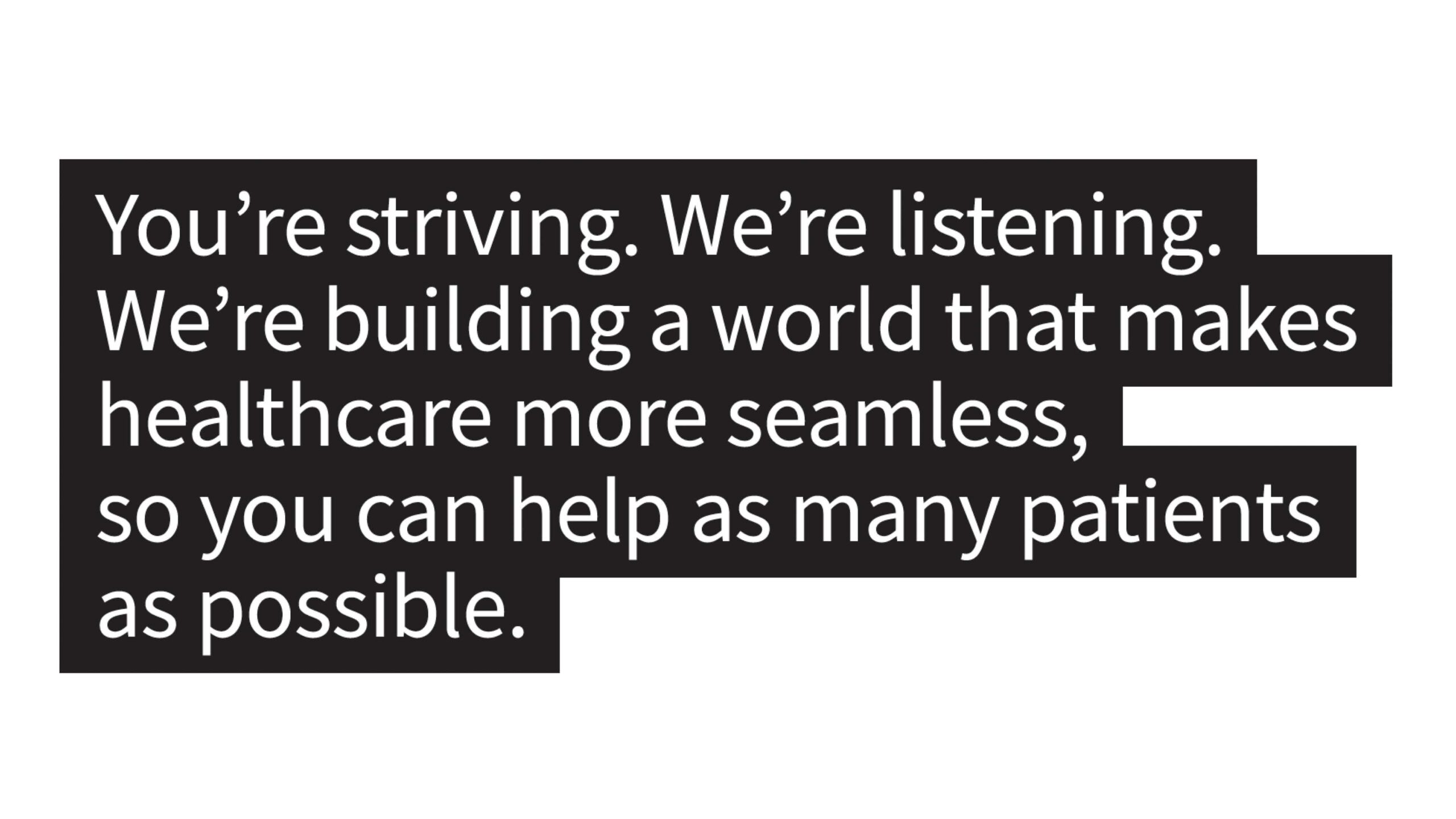
Highlighted type (special use)
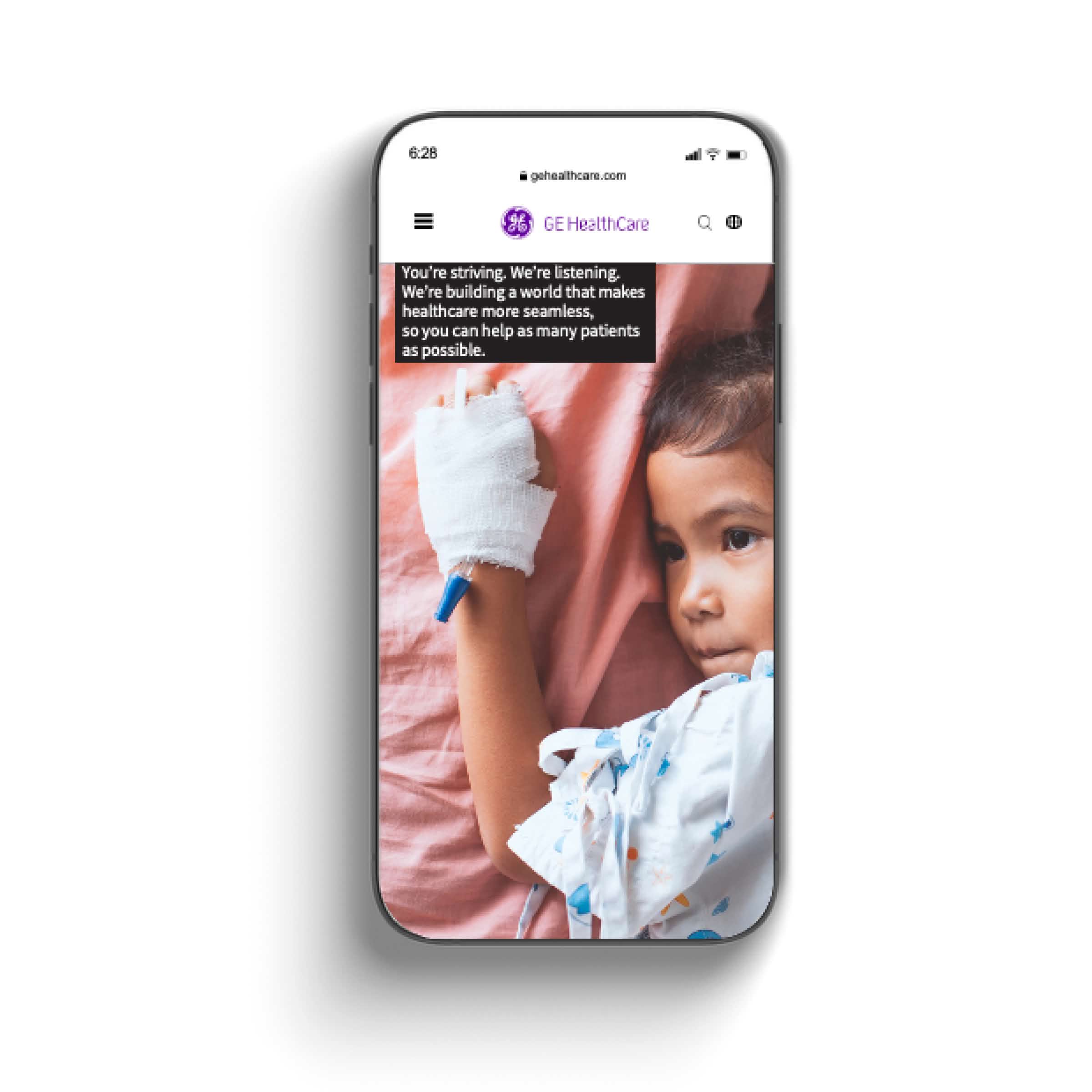
Use highlighted type only for ADA compliance and specific digital use cases.
Limit its use to situations where text appears over a complex image. Place black color blocks behind the typography to maintain legibility.
Do not use Compassion Purple in highlight bars.
Apply highlighted type only to subheadlines or body copy, never to headlines.
Typography don’ts
Using typography correctly is essential to maintaining brand consistency. Avoid the use cases shown.
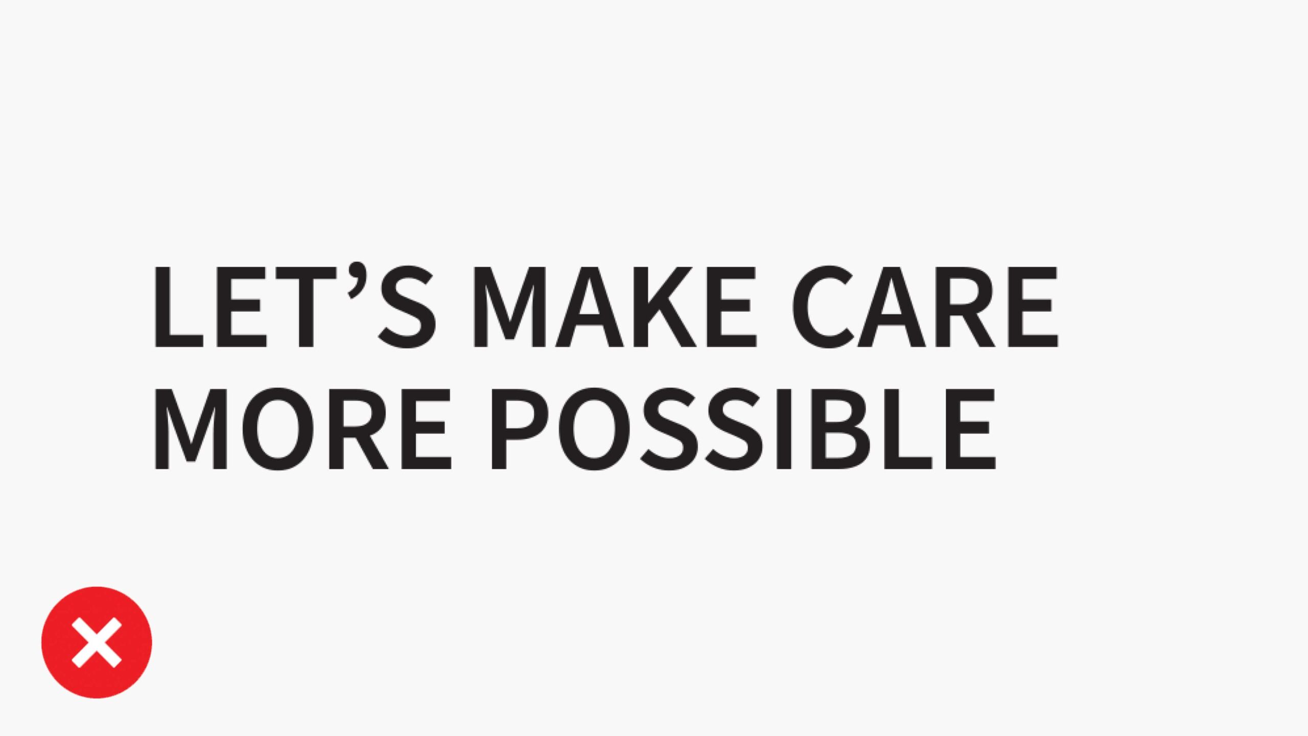
Don’t use all caps in headlines.
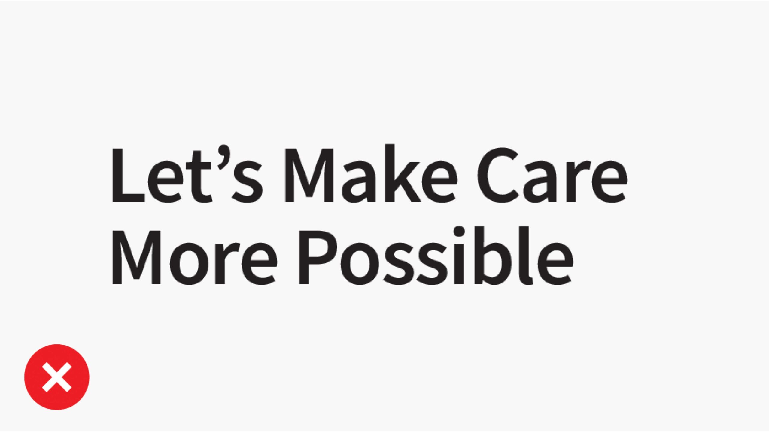
Don’t use title case in headlines.
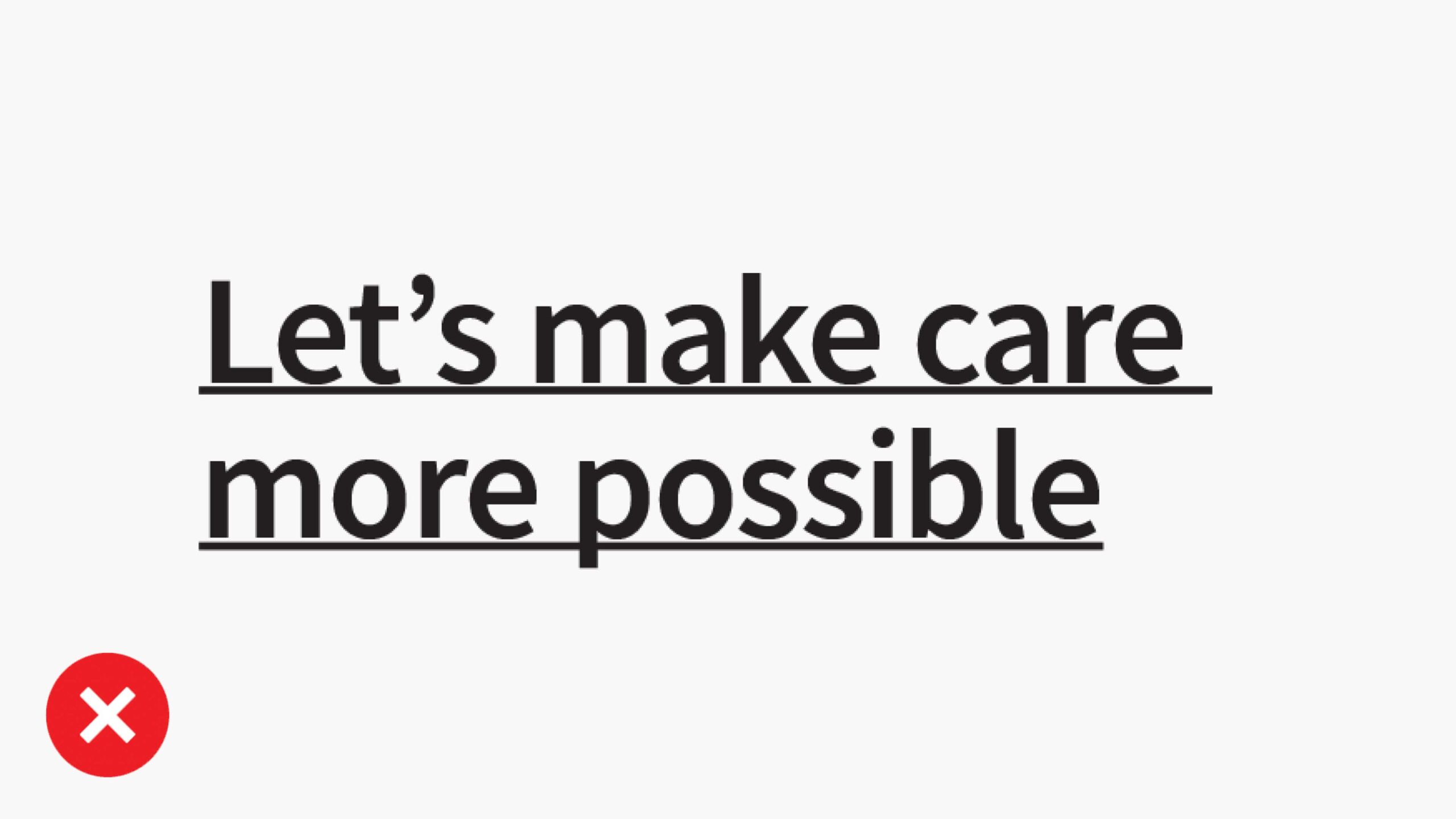
Don’t used underlines in headlines.
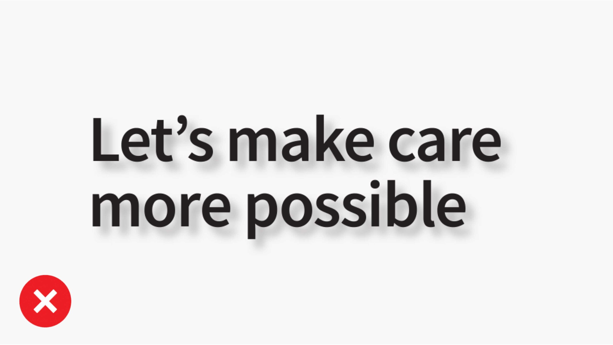
Don’t apply drop shadows to headlines.
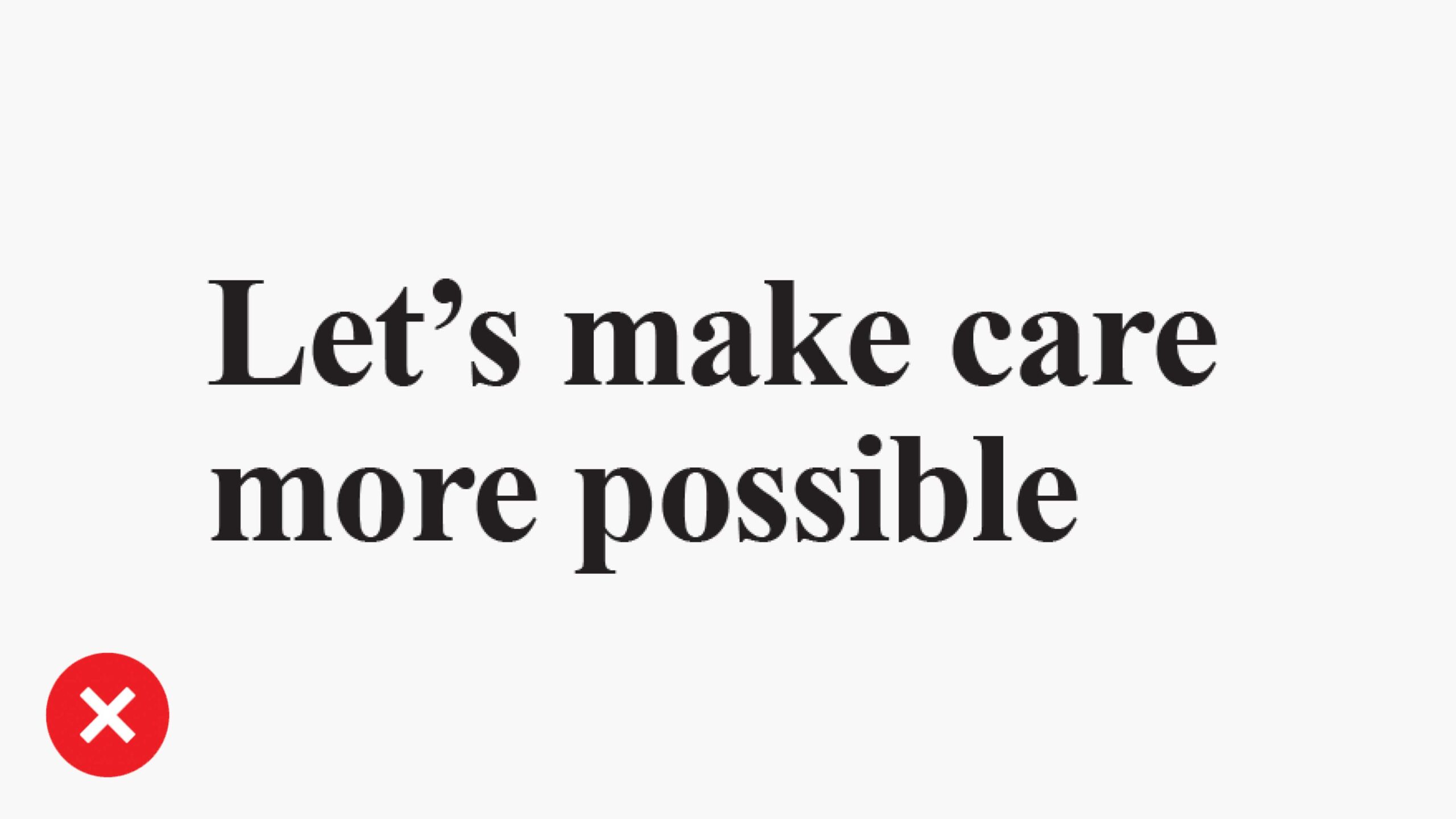
Don’t use unapproved fonts.
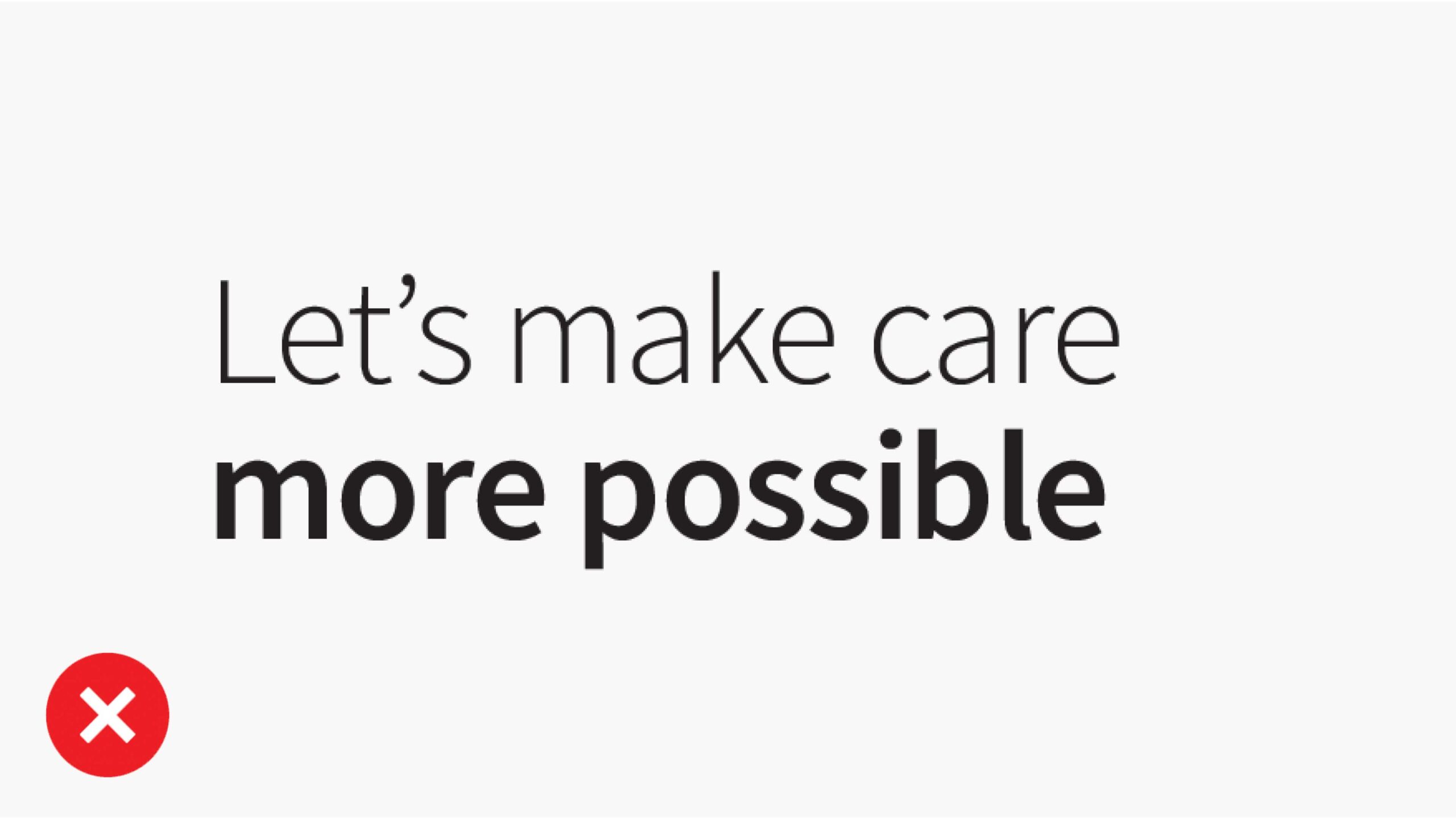
Don’t combine other type weights in SemiBold headlines.
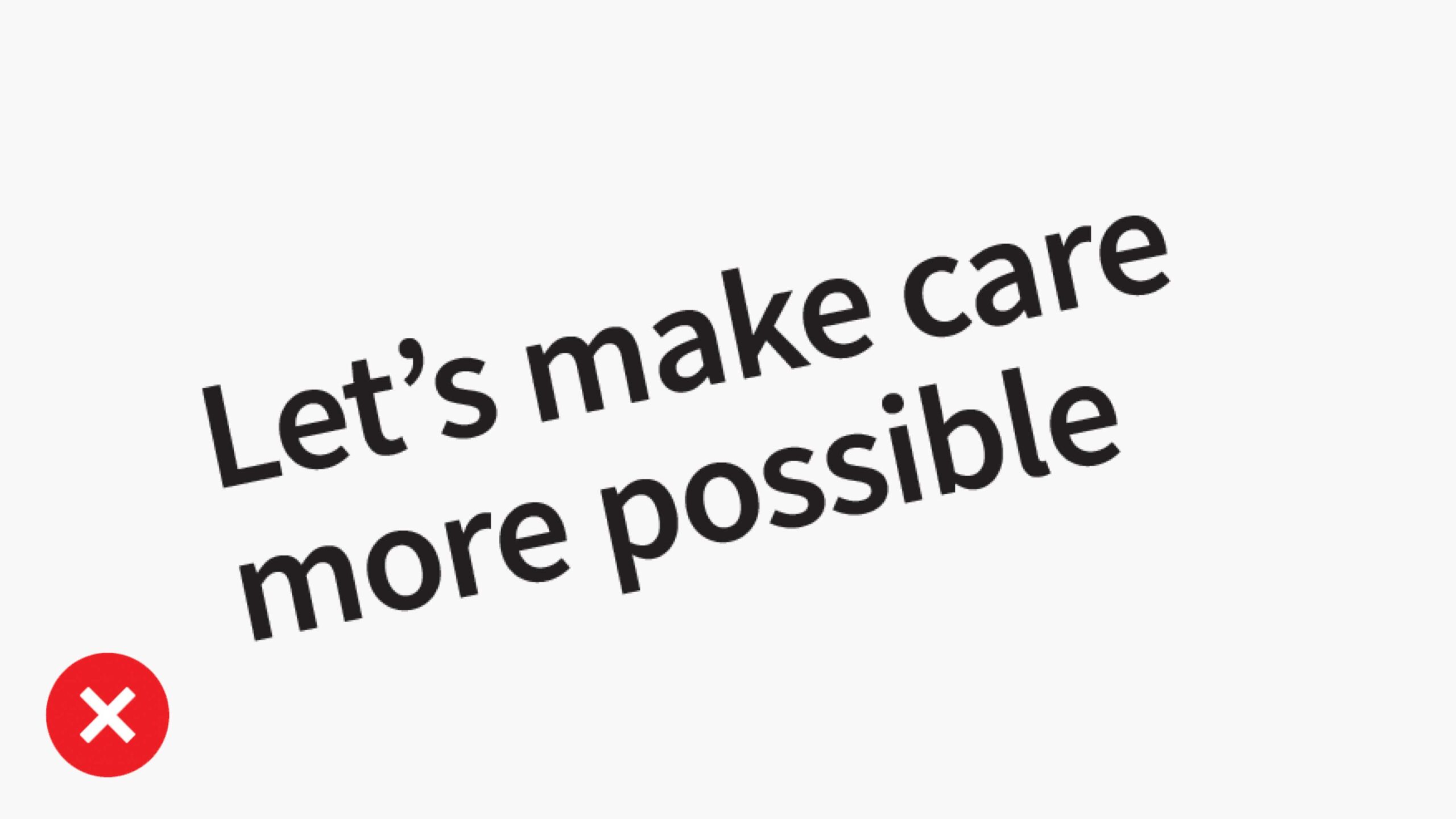
Don’t rotate typography other than 90°.
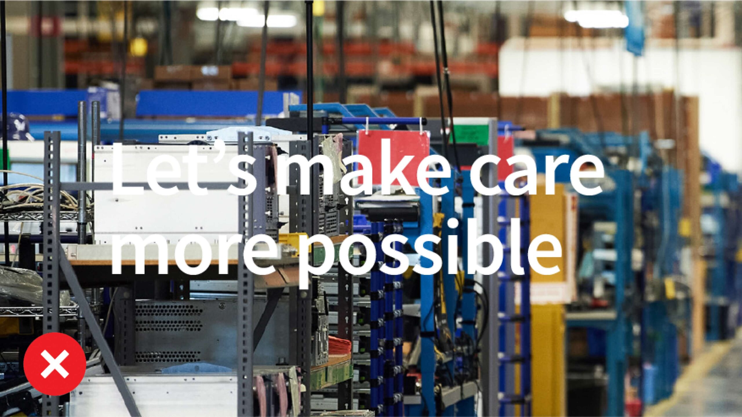
Don’t place text over a busy background. Make sure there is enough contrast forlegibility.
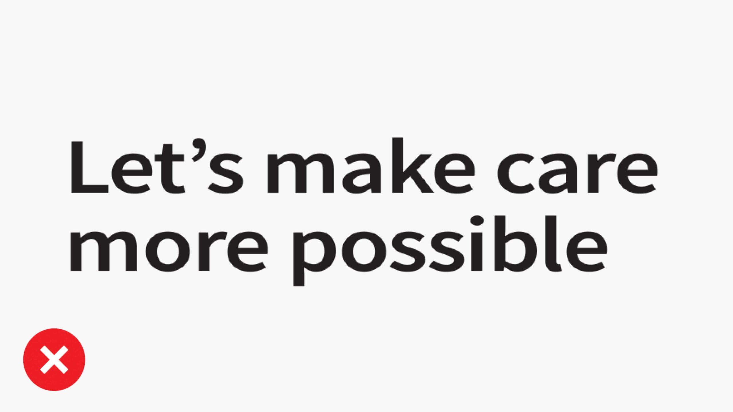
Don’t distort type.
Highlighted type don’ts
Using highlighted type correctly is essential for maintaining brand consistency. Avoid the use cases shown.
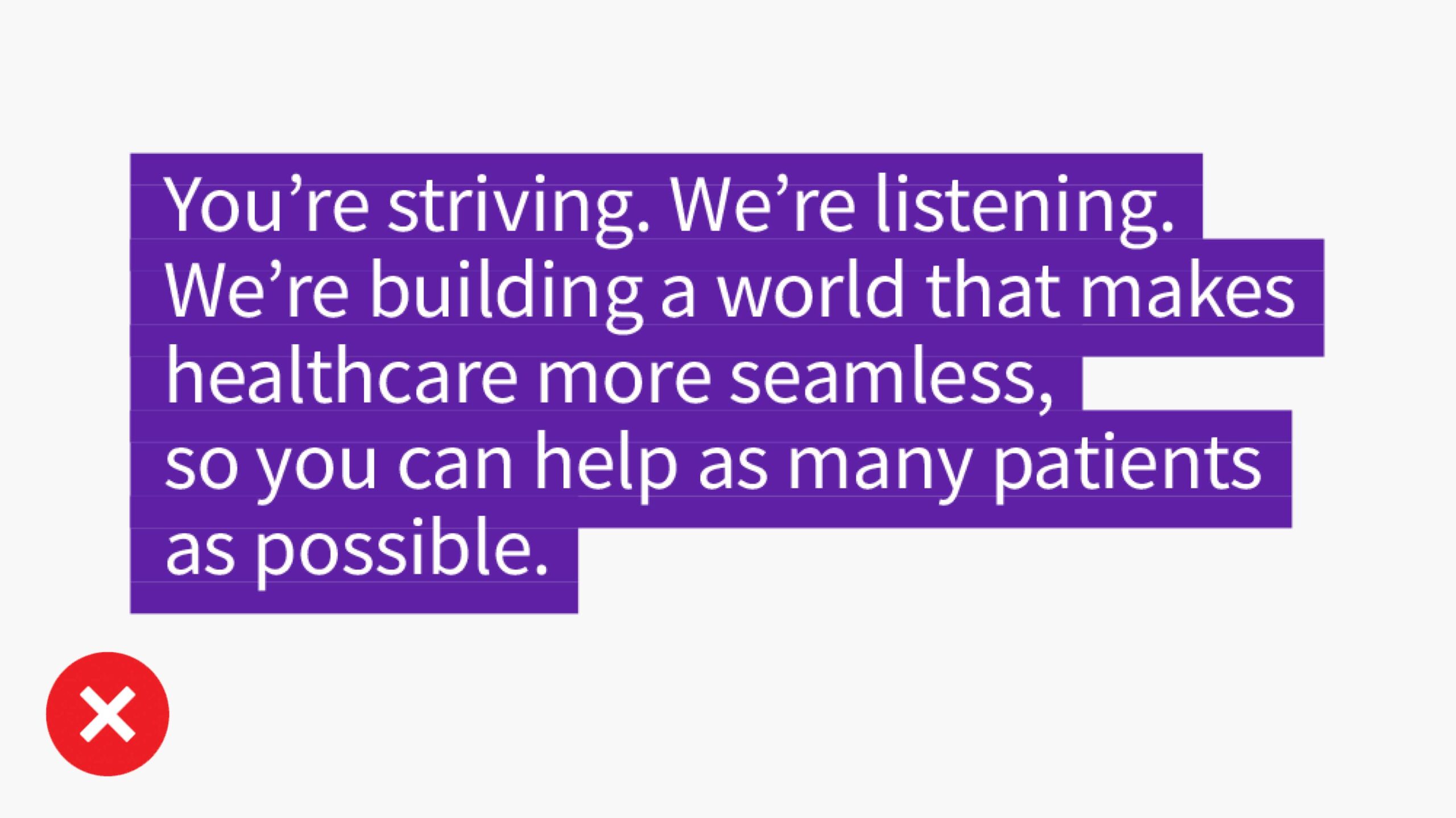
Don’t apply Compassion Purple to the highlight bars.
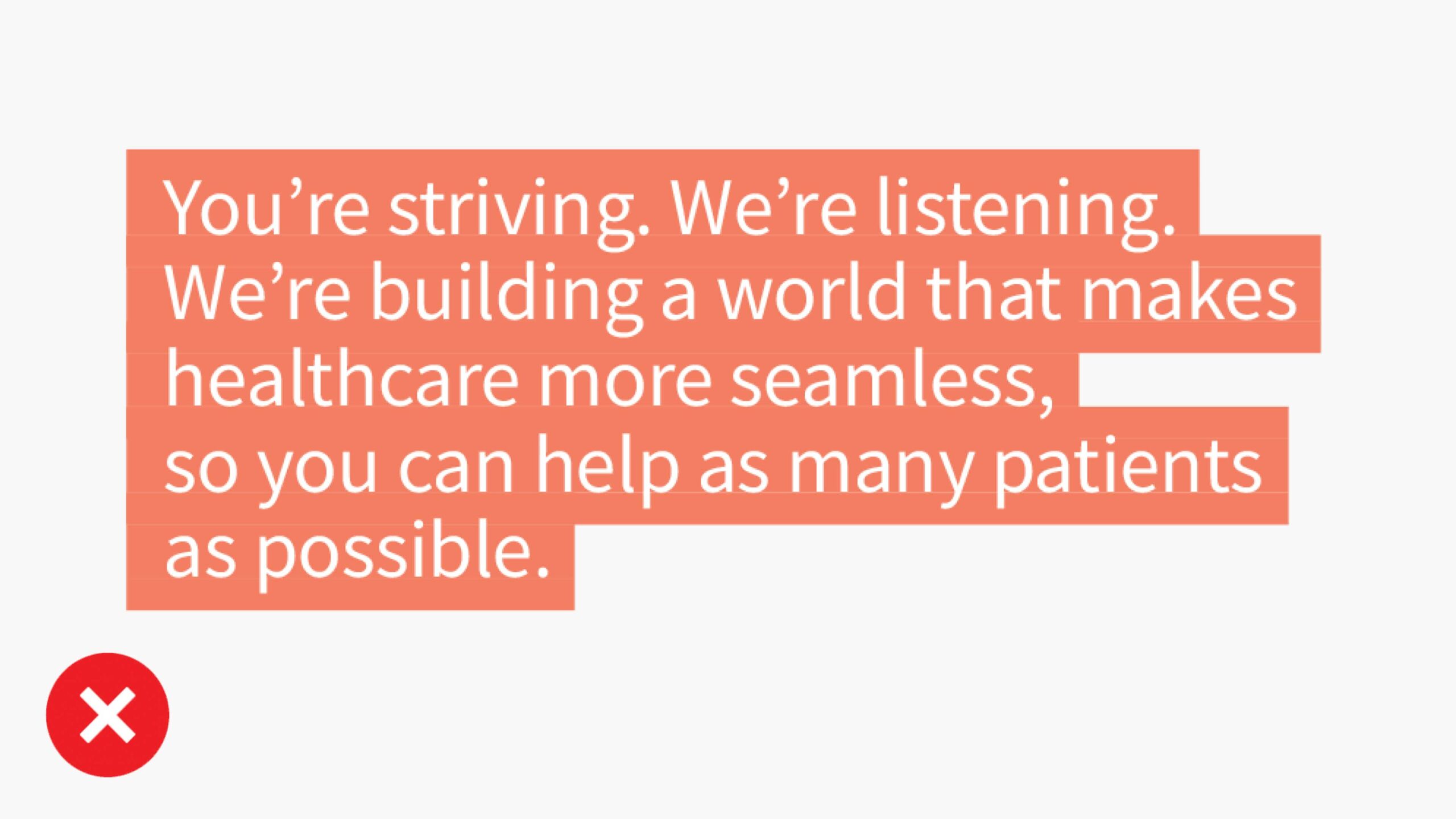
Don’t apply colors from the secondary palette to the highlight bars.
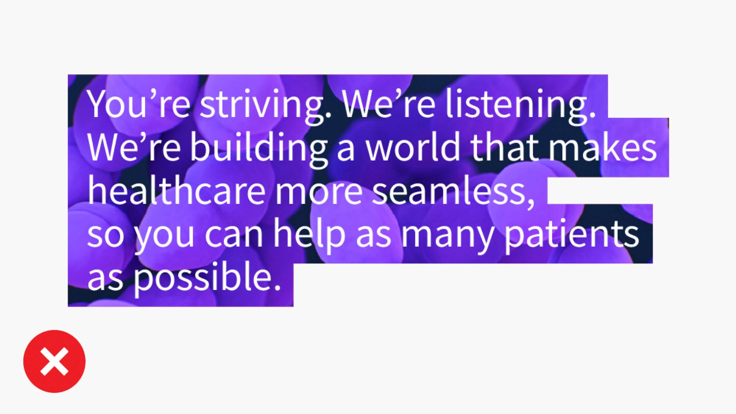
Don’t crop images inside the highlight bars.
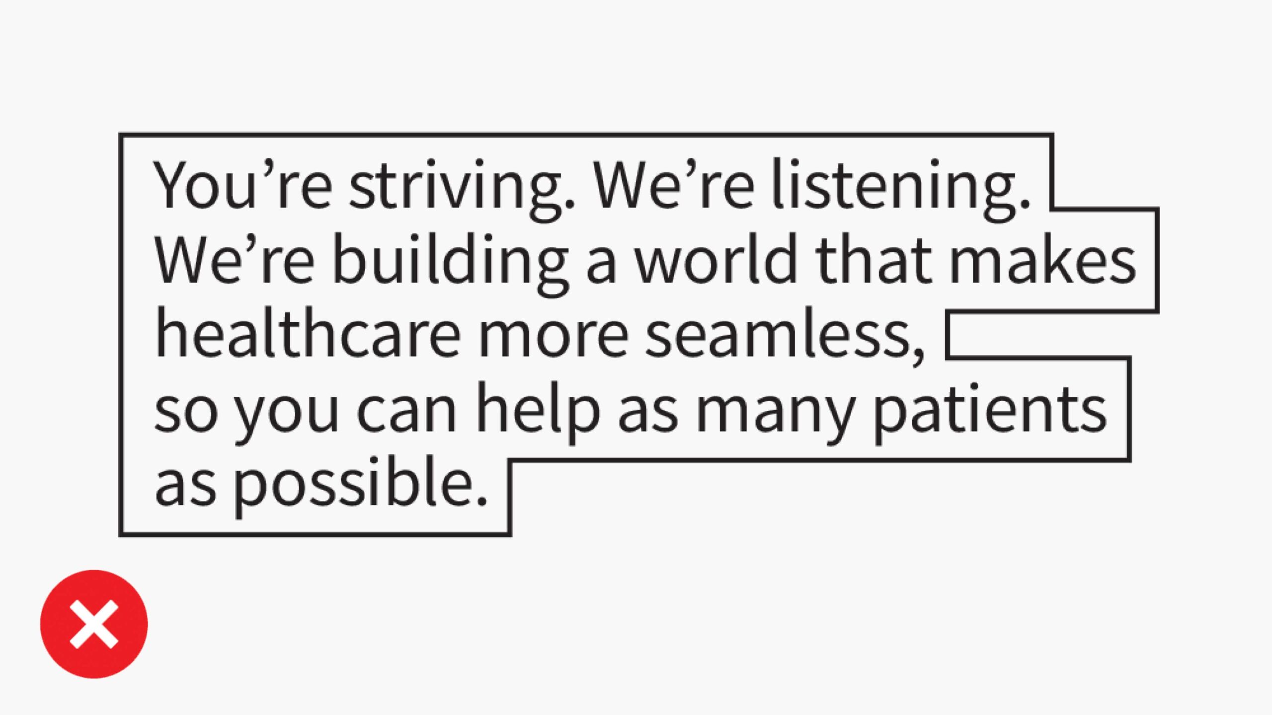
Don’t apply outlines to the highlight bars.

Don’t change the opacity of the highlight bars.
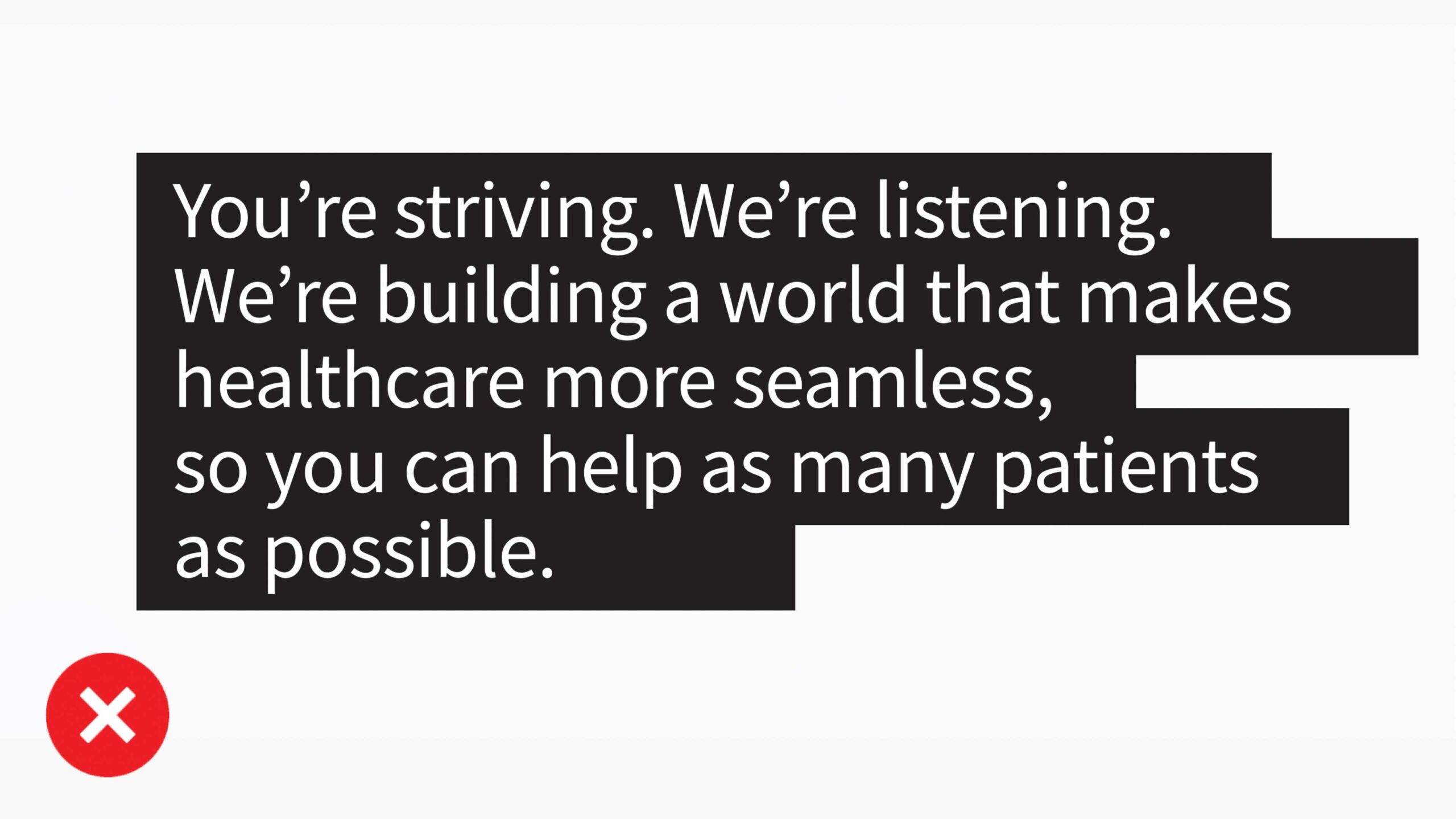
Don’t extend bars further than the words.