
Our logo
Logo narrative
GE HealthCare’s brand identity reflects our optimistic outlook for the future. We are advancing personalized, connected and compassionate care while restoring humanity to the healthcare experience.
We are GE HealthCare.
We intentionally chose “GE HealthCare” as our brand and company name. The capital “H” and “C” signal the connection between better care and better health and reinforce our commitment to advancing both. Always use our full name, GE HealthCare.
“GEHC” is our stock ticker symbol. It is not our name and is not a licensed trademark. Use “GEHC” only when referencing the stock symbol or as a defined term in contracts or other legal or regulatory documents.
Do not translate our logo unless legally required or necessary for cultural reasons. If translation is required, contact brand.health@gehealthcare.com.
Logo versions
There are three logo versions available for various scenarios:
Horizontal (primary), Stacked (limited space only) and Platform (special use)
Horizontal (primary)
Use the horizontal logo across applications for consistency and maximum impact.

Stacked (limited space only)
Use the stacked logo only when space constraints prevent use of the primary horizontal logo. The vertically stacked configuration requires approval from the GE HealthCare brand team at brand.health@gehealthcare.com.
Platform (special use)
Use the Platform logo in select instances, such as advertising, where the logo appears on imagery and legibility is critical.
GE Monogram
Never use the GE Monogram separately from the wordmark except in preapproved use cases such as a digital favicon or social media avatar. In those instances, the Monogram must appear only in Compassion Purple. Any other isolated use of the Monogram requires approval from the GE HealthCare brand team.
Trademark Licensing Agreement “GE” and “GE HealthCare” are trademarks of the General Electric Company and are licensed to GE HealthCare under a trademark licensing agreement (TMLA). For more information, refer to the TMLA guidelines.
Monogram (preapproved use cases only)
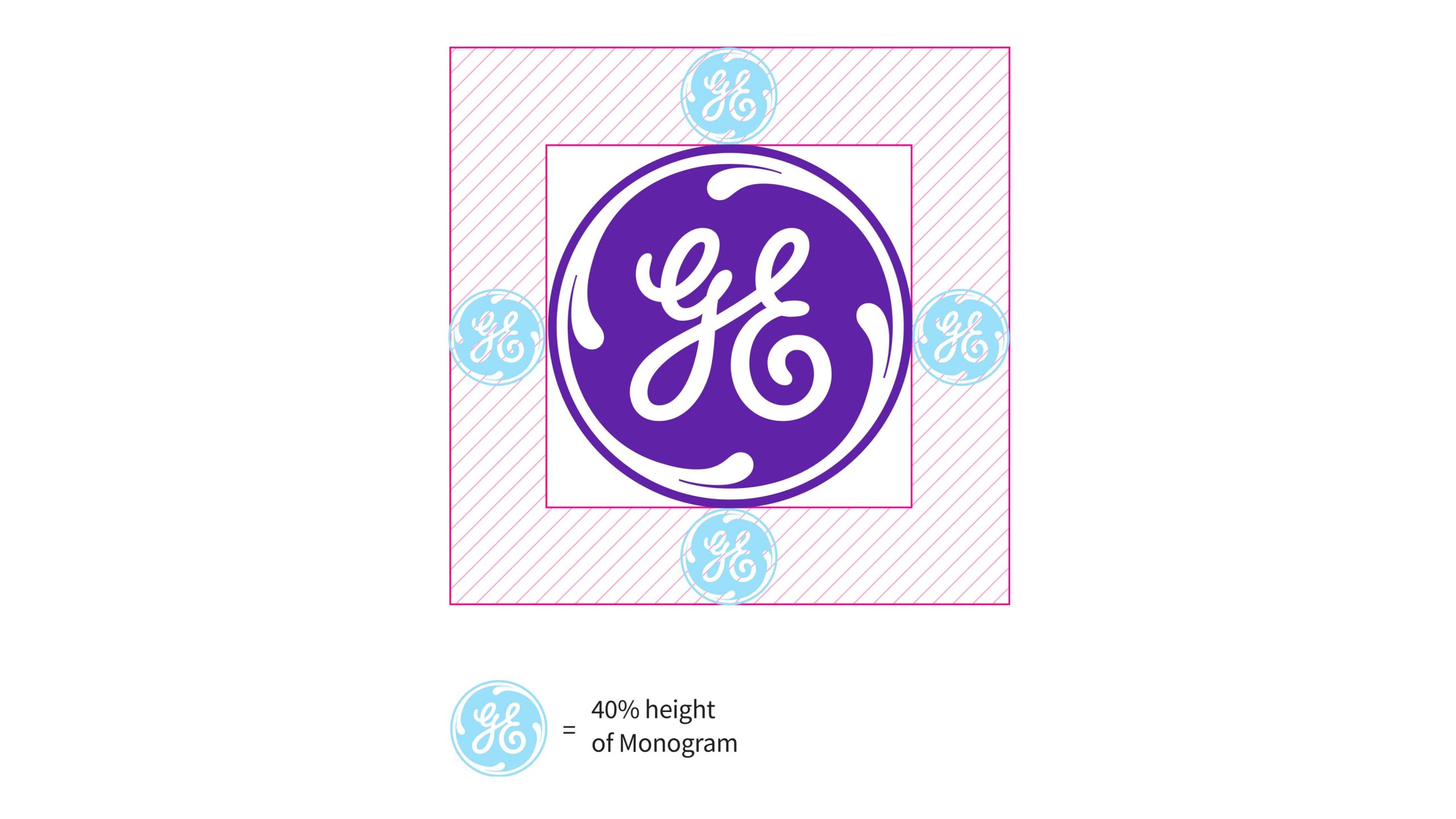
Monogram minimum clear space
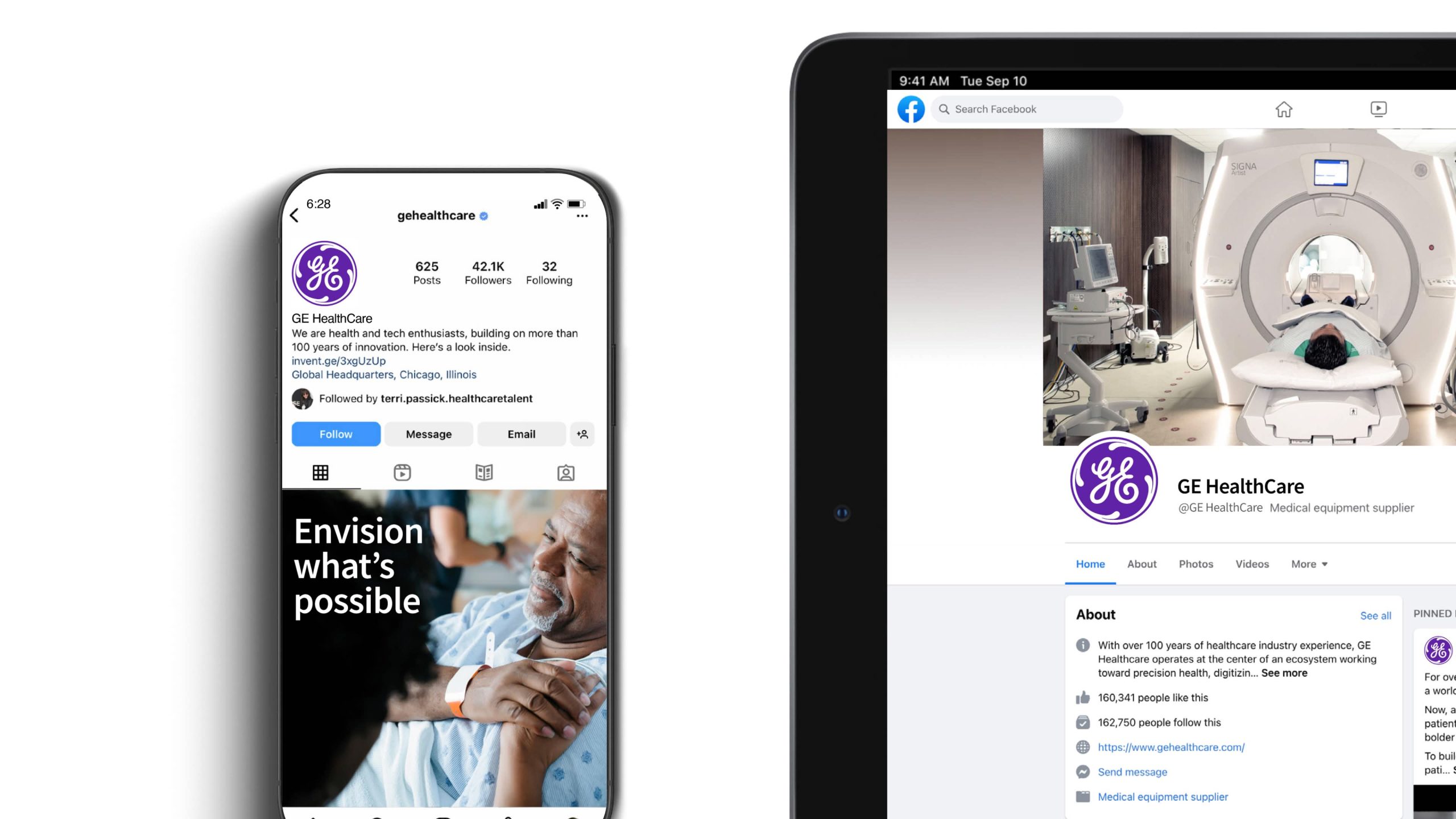
In certain digital environments with limited space, like social media, the clear space can be reduced by half or 20% the height of the Monogram.
When the Monogram alone is featured as a social media avatar on a platform that utilizes a circular container shape, size the Monogram to allow a surrounding white border, as shown above, so the Monogram complements photography and doesn’t compete with it.
Logo color
Color variations
Use the full-color logo on white backgrounds or over photography with ample clear space.
Reverse logo
Use the reverse logo on Compassion Purple or, when appropriate, on black backgrounds or dark photography.
Black logo
Reserve the black logo for special use in non-color applications, ideally on a white or light background.
Full-color (preferred)

Full-color logo over image
Reverse

Reverse logo over image
Black (special use)

Black logo over image
Logo sizing
Primary logo minimum clear space and size
Minimum clear space
Maintain clear space around the logo to preserve its impact and visibility. Keep this area free of all type and graphic elements. The minimum clear space must equal 40% of the height of the Monogram.
Minimum size
Measure minimum size by the height of the Monogram. For print, the logo must be at least .35 in / 9 mm tall. For digital, it must be at least 25 px tall.
These are minimum requirements. In most applications, the logo should appear larger. Never display the logo smaller than the minimum size, as this compromises quality and legibility.
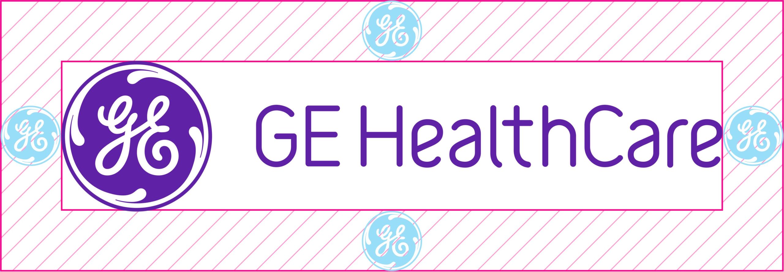
Logo minimum clear space
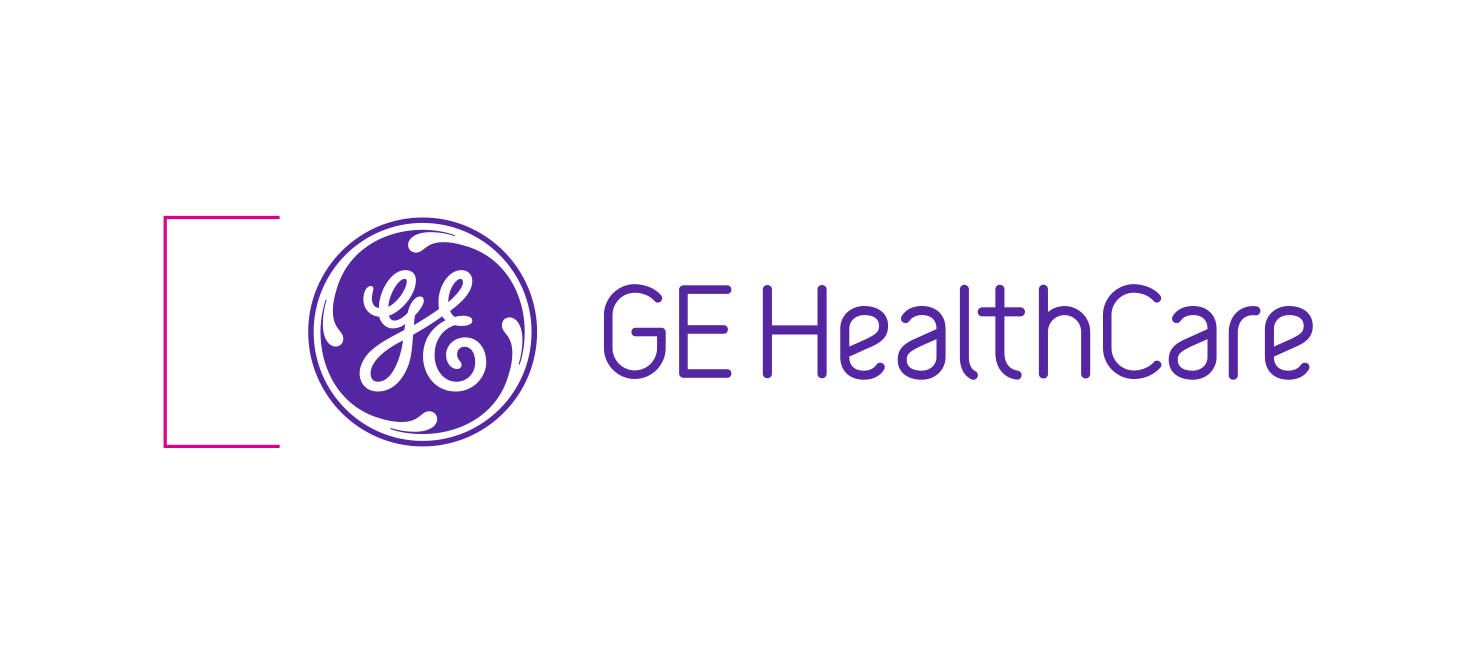
Logo minimum size
Print: .35″/ 9mm tall
Digital: 24px tall
Stacked logo minimum clear space and size
Use the stacked logo only when space constraints prevent use of the primary horizontal logo. The vertically stacked configuration requires approval from the GE HealthCare brand team.
Minimum clear space
Maintain clear space around the logo to protect its impact and visibility. Keep this area free of all type and graphic elements. The minimum clear space must equal 40% of the Monogram height.
Minimum size
Measure minimum size by the height of the Monogram. For print applications, the logo must be at least .35 in / 9 mm tall. For digital applications, it must be at least 25px tall.
These dimensions represent the minimum. In most cases, the logo should appear larger. Never display the logo below the minimum size, as this compromises quality and legibility.
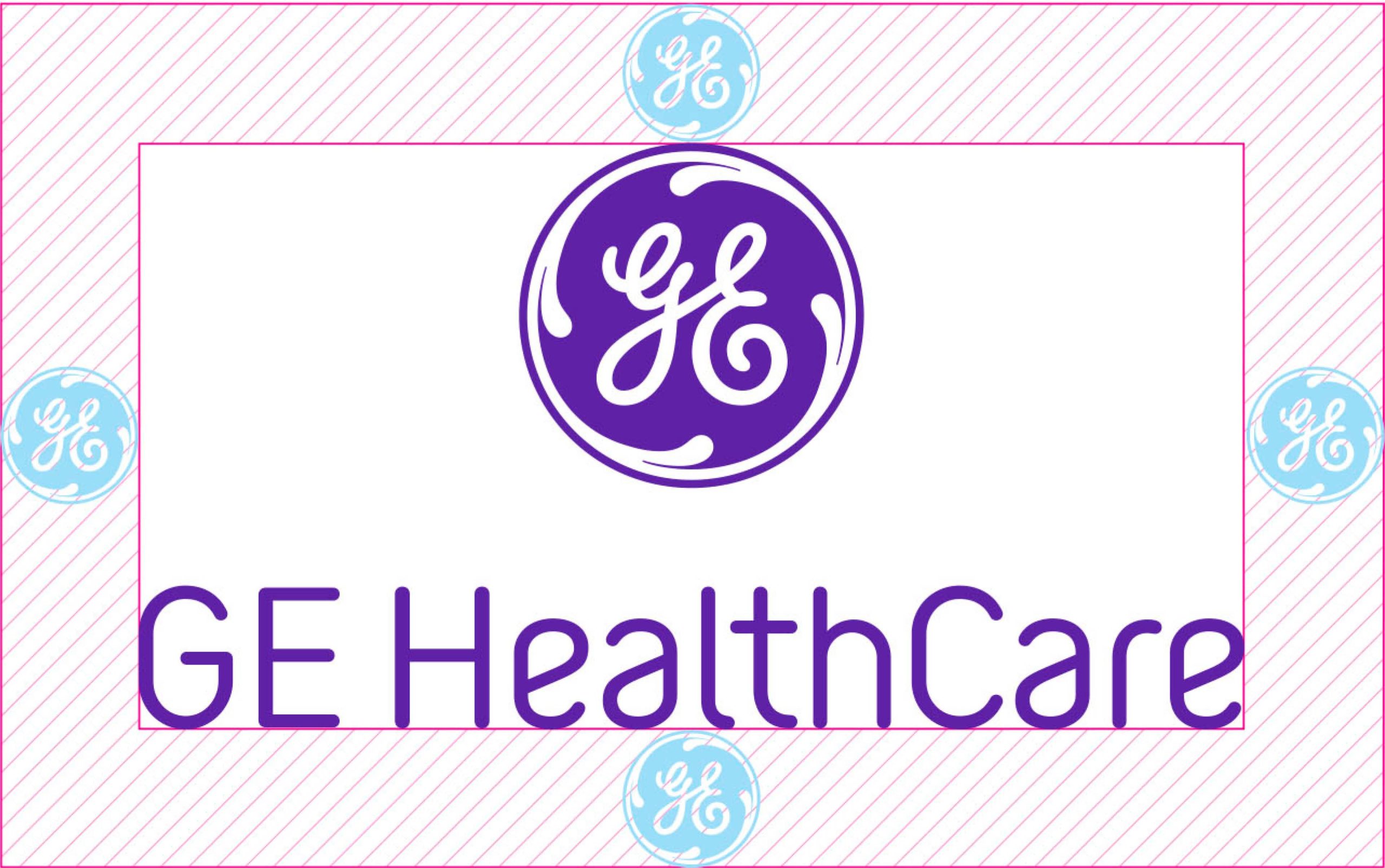
Logo minimum clear space
Logo minimum size
Print: .35″/ 9mm tall
Digital: 25px tall
Logo sizing and placement
Logo sizing and placement are essential for maintaining harmony and consistency across all applications.
Always position the logo within the application’s live area. Keep the designated clear space free of other elements, including type and graphic components. Refer to the examples and captions shown here for approved placement guidance.
To size the logo correctly, ensure the height of the Monogram equals 125% of the application’s margin.
In extreme cases where margins are unusually small or large, adjust the logo visually to maintain balance and legibility.
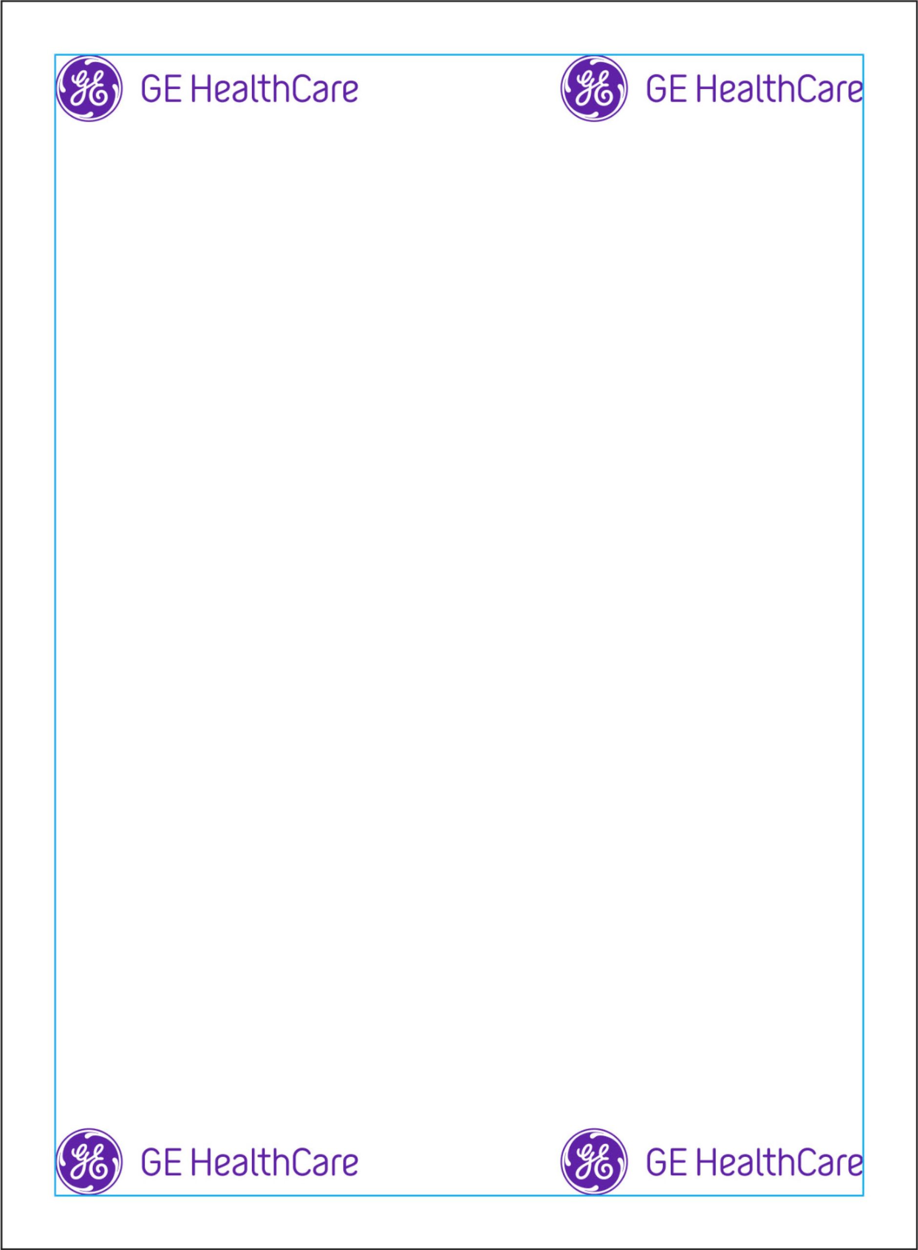
Logo may be placed in any of the four corners, inside the margins.
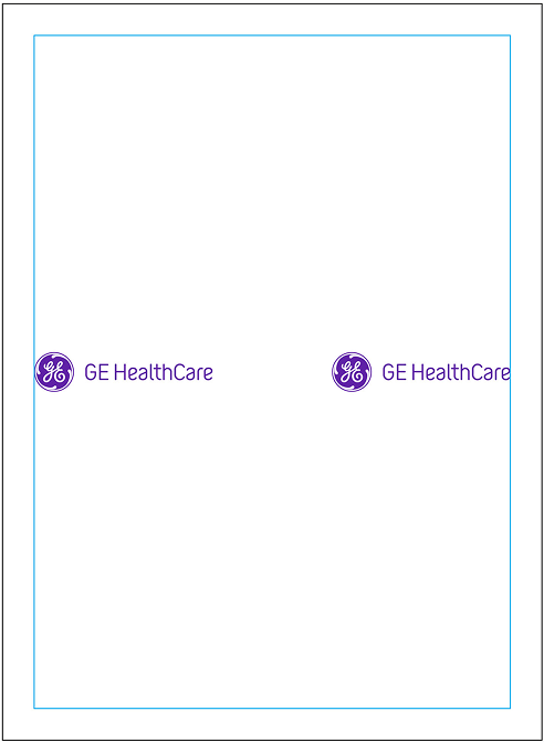
Logo may be centered vertically in the format, inside the margins, aligned left or right.
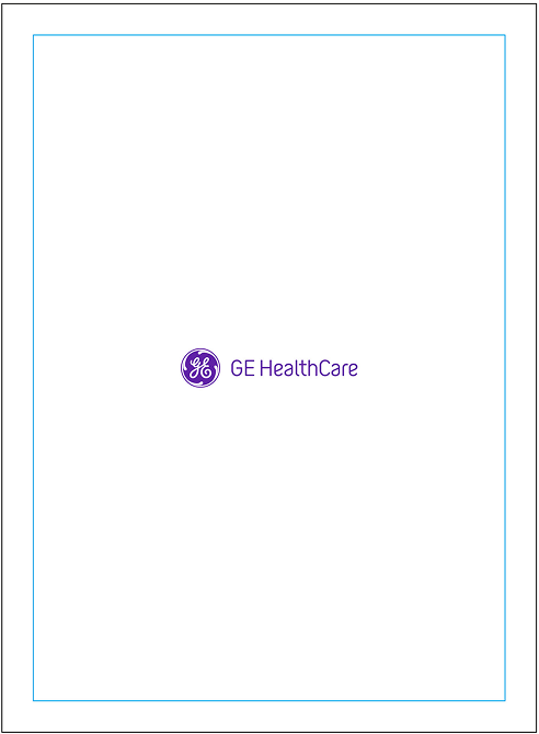
Logo may be placed in the center of the layout.
Logo sizing flexibility
In some applications, the logo may appear at a larger scale. Refer to the examples shown for guidance on sizing in these scenarios.
In all cases, maintain the standard clear space equal to 40% of the Monogram height.
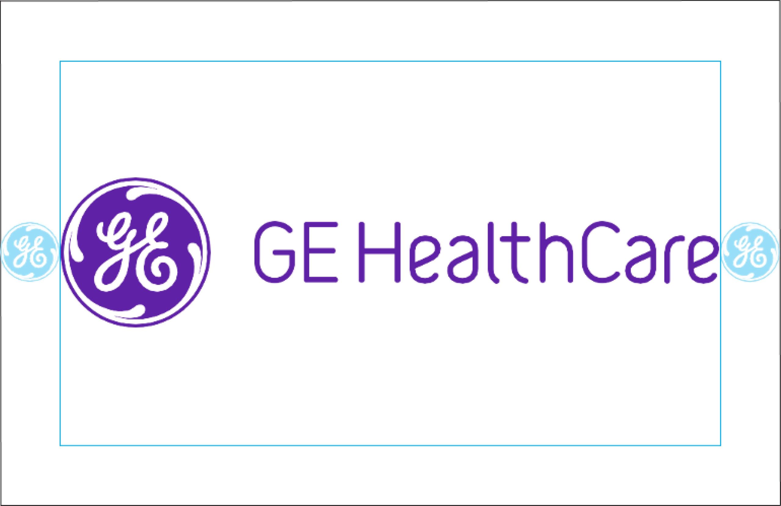
The logo may be sized to maximum width within a horizontal format, as long as it doesn’t violate the standard clear space.
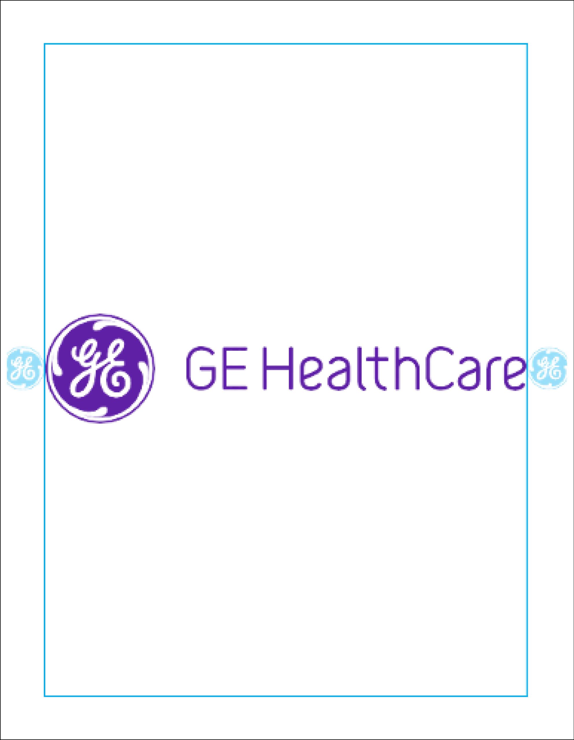
The logo may be sized to maximum width within a vertical format, as long as it doesn’t violate the standard clear space.

= 40% height of Monogram
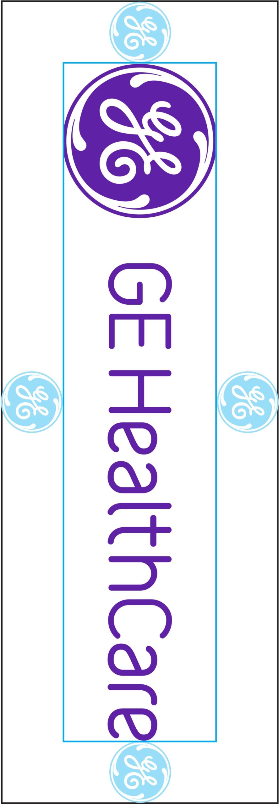
In special use cases when horizontal space is limited, the logo can be rotated clockwise by 90° with the Monogram always on top. Usage of the rotated logo configuration requires approval by GE HealthCare’s brand team.
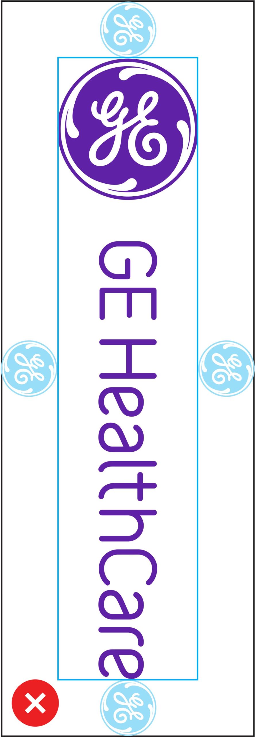
Make sure the entire logo, including the Monogram, is rotated 90°.
Logo integrity
Preserve the integrity of the GE HealthCare logo by giving careful consideration to placement and brand hierarchy across all materials. Text, third-party logos or icons must never compete with the logo or disrupt the established hierarchy. Avoid creating the impression of sub-branding or preferential treatment of any business group within GE HealthCare.
Horizontal plane
Regardless of placement, no other element may appear on the same horizontal plane as the logo.

Once the logo is placed, the horizontal plane should remain clear of text, logos and other imagery.
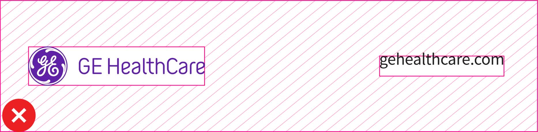
Do not place URLs or any other elements along the same horizontal plane as the logo.
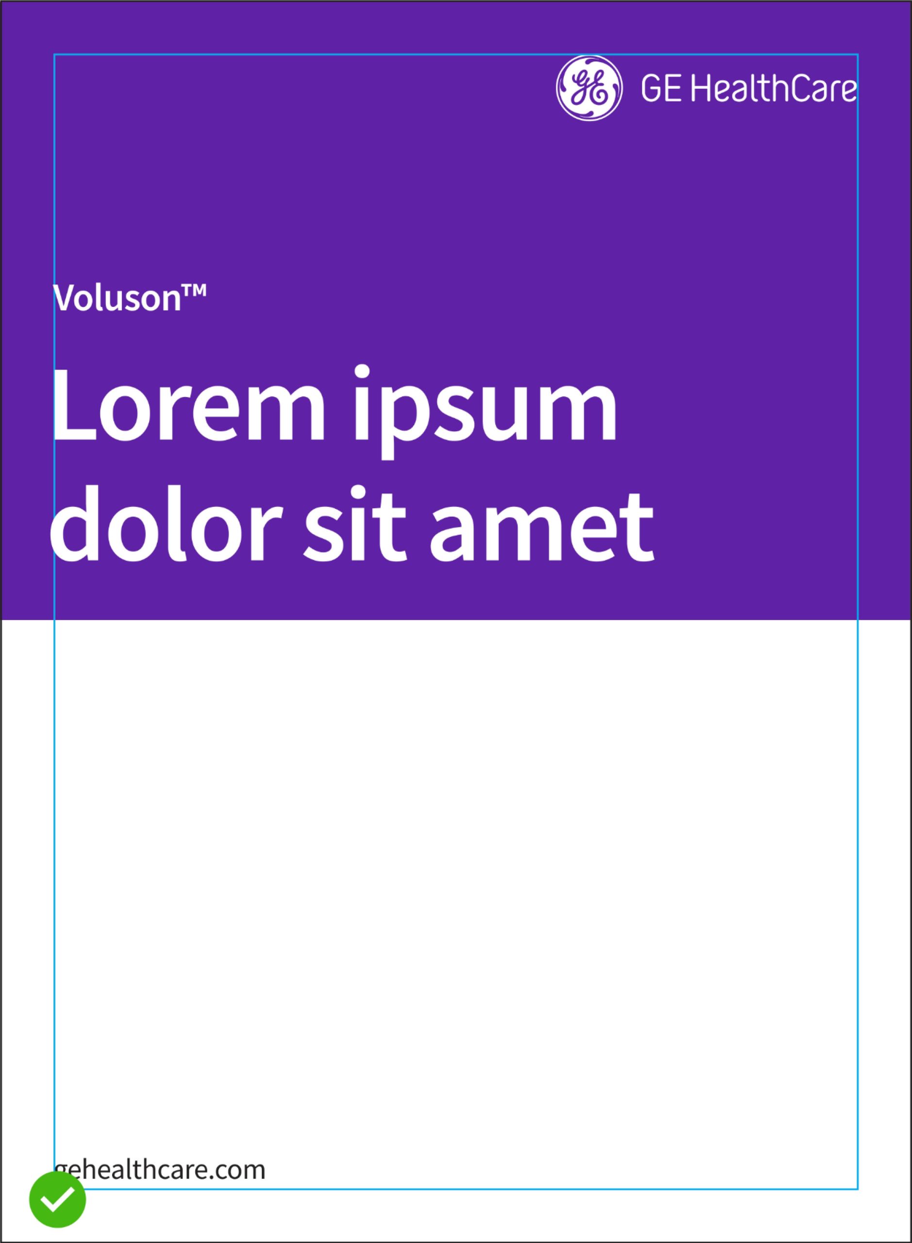
Headlines, titles, logos, and other imagery should always be placed below the GE HealthCare logo.
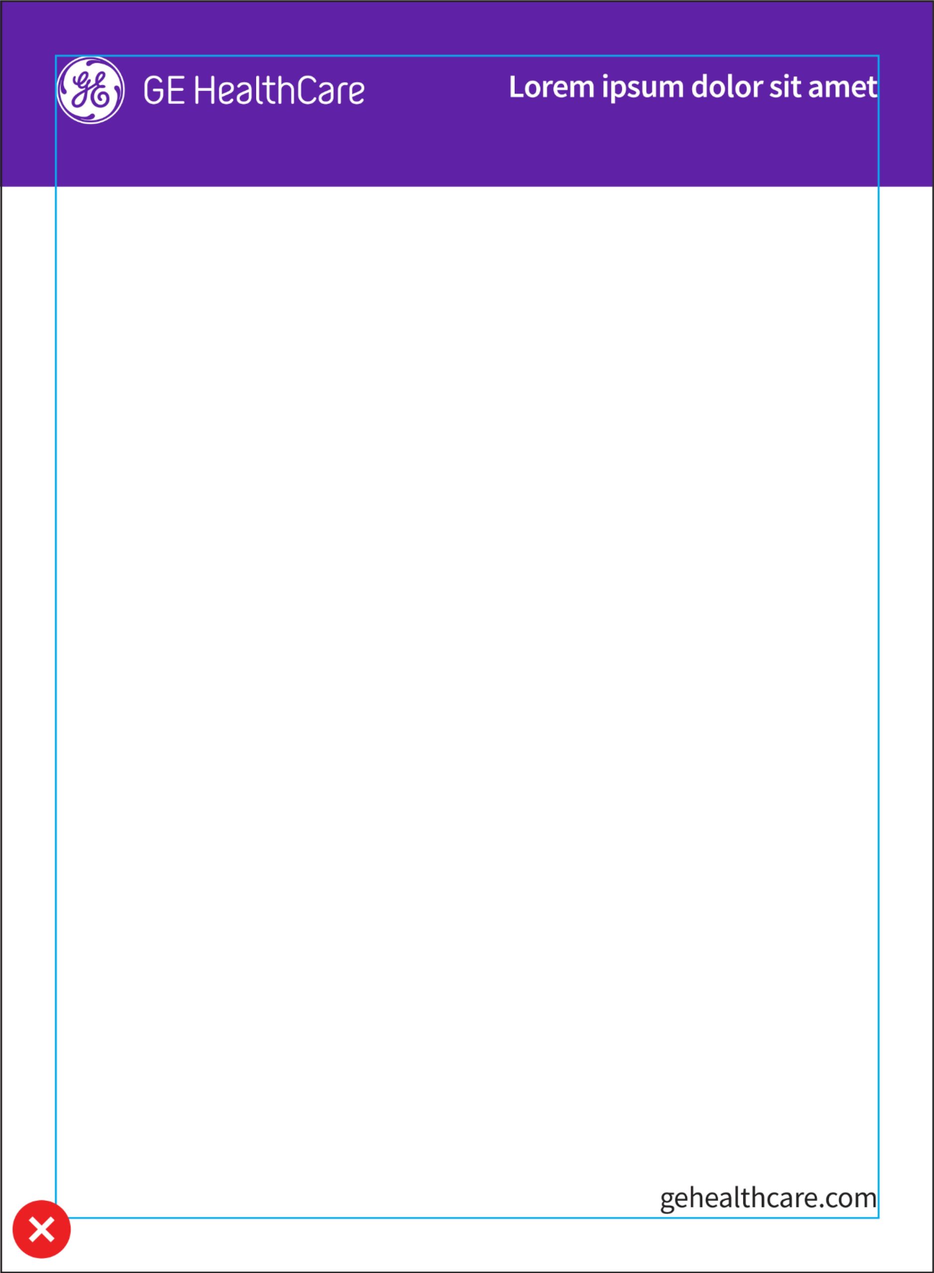
Do not add text, links, or headlines to the same horizontal plane as the GE HealthCare logo.
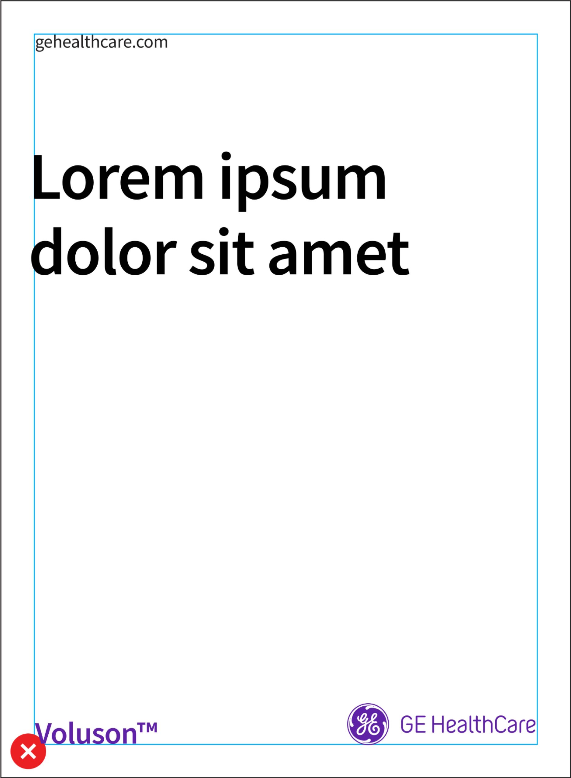
Do not add product names, icons, or other imagery to the same horizontal plane as the GE HealthCare logo.
Logo don’ts
Using the logo correctly helps maintain brand consistency. Avoid the highlighted use cases.
Do not use the reverse Monogram on a Compassion Purple background. For social media or other limited-space applications where the Monogram appears alone, display it in Compassion Purple on a white background.
Any use of the Monogram in isolation requires approval from the GE HealthCare brand team at brand.health@gehealthcare.com.
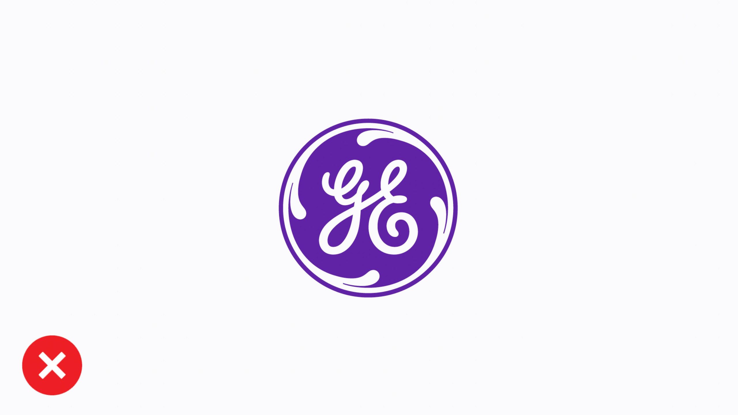
Don’t use the Monogram in isolation (except for preapproved digital/social icons or with express approval from GE HealthCare’s Brand Team).
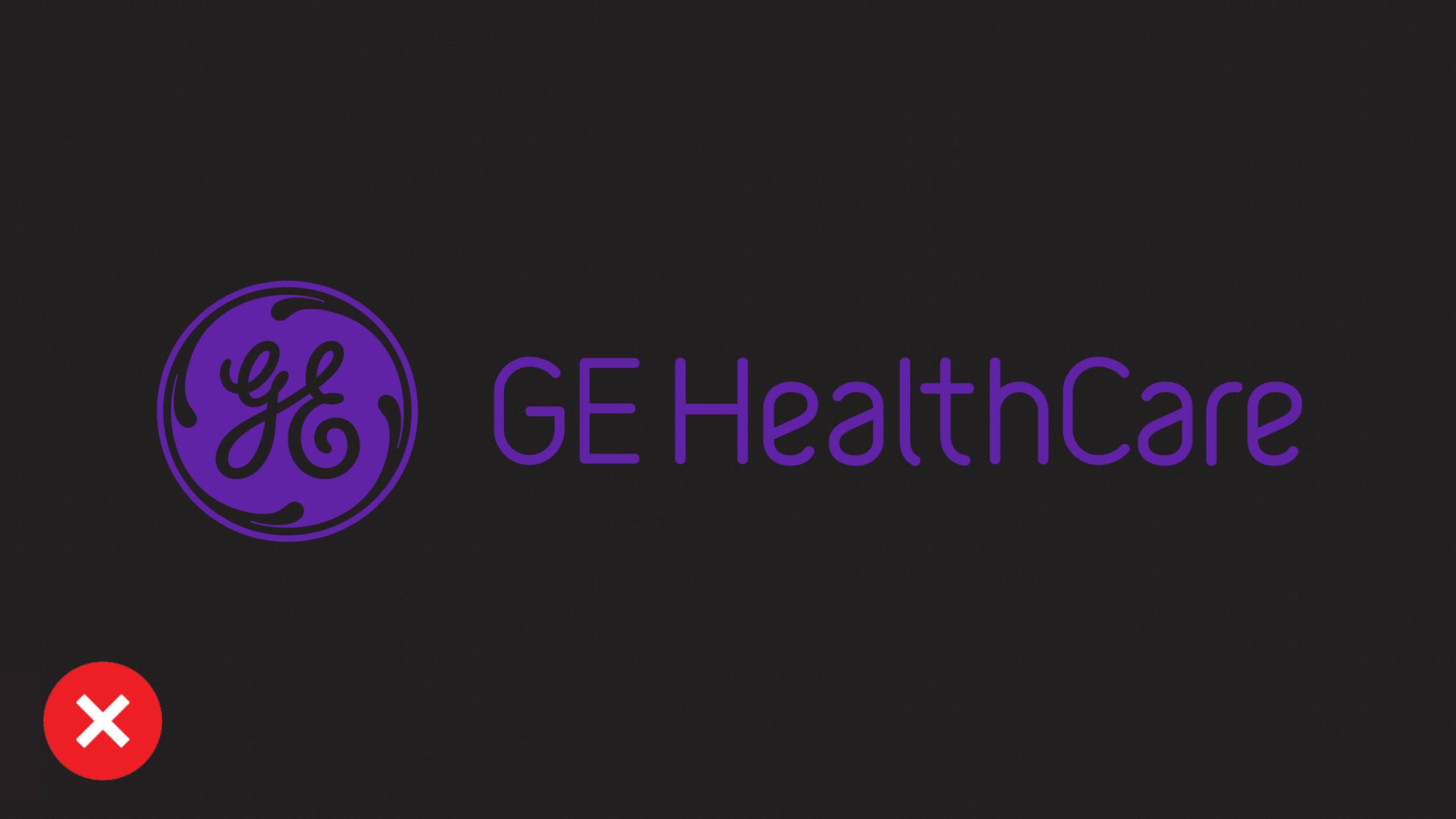
Don’t apply full-color (Compassion Purple) logo on black background.
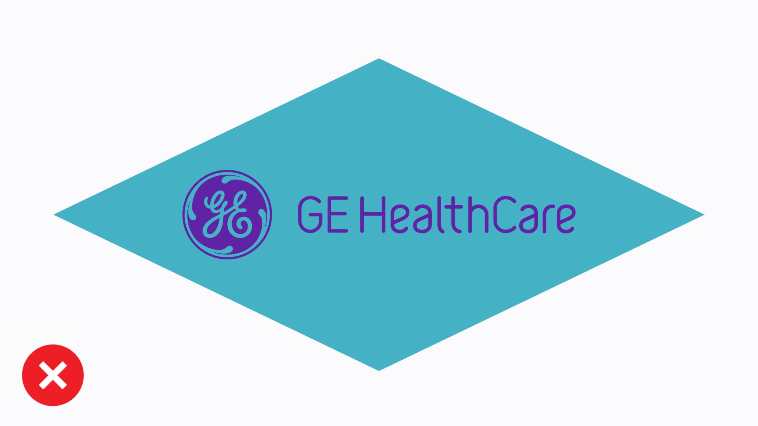
Don’t place the logo in another shape or on an accent color background.
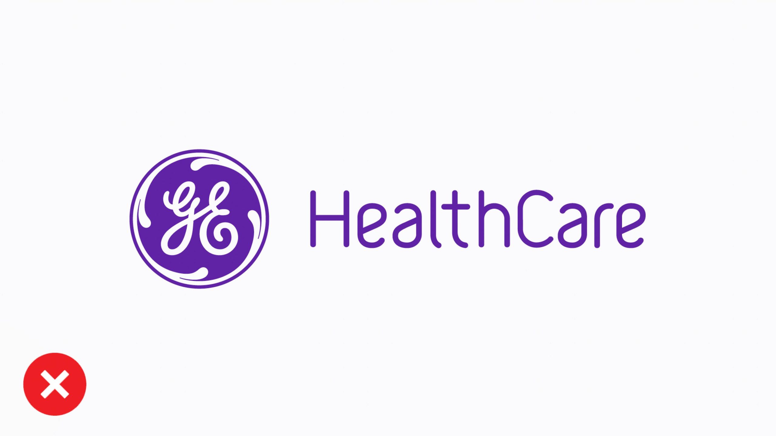
Don’t remove the “GE” letters from the logo.

Don’t change the opacity of the logo when placed on top of imagery.
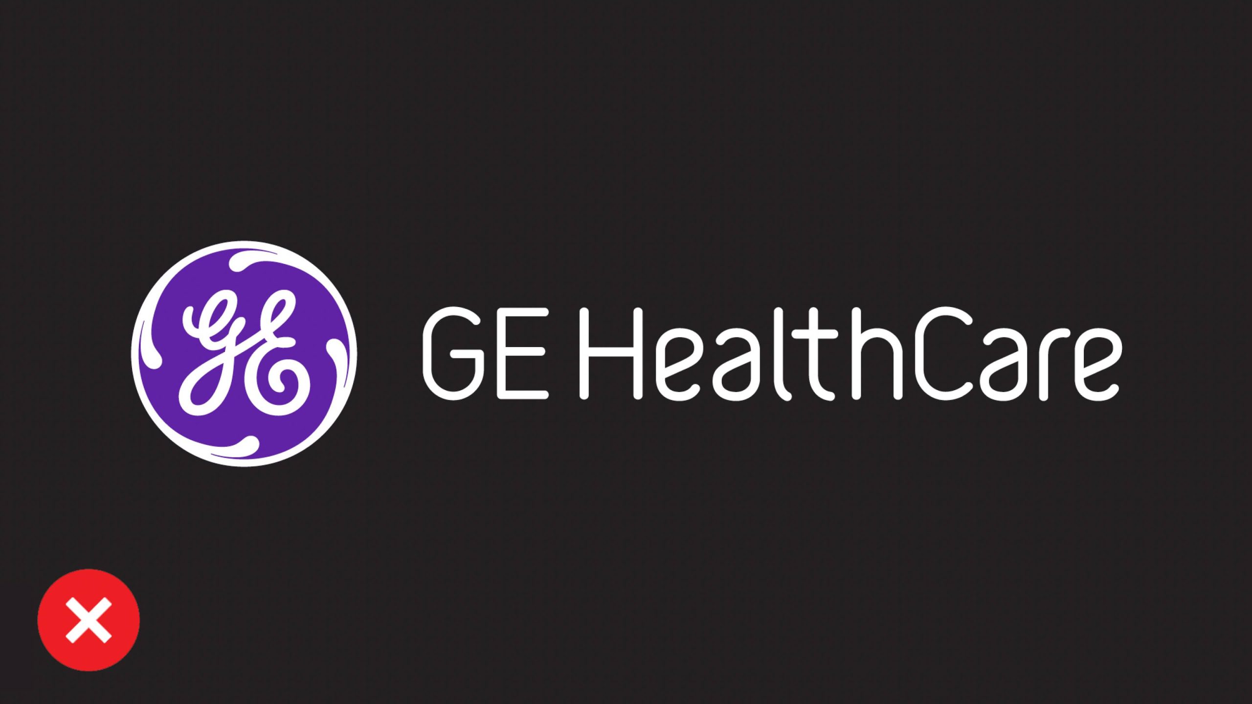
Don’t place Compassion Purple behind a white Monogram.
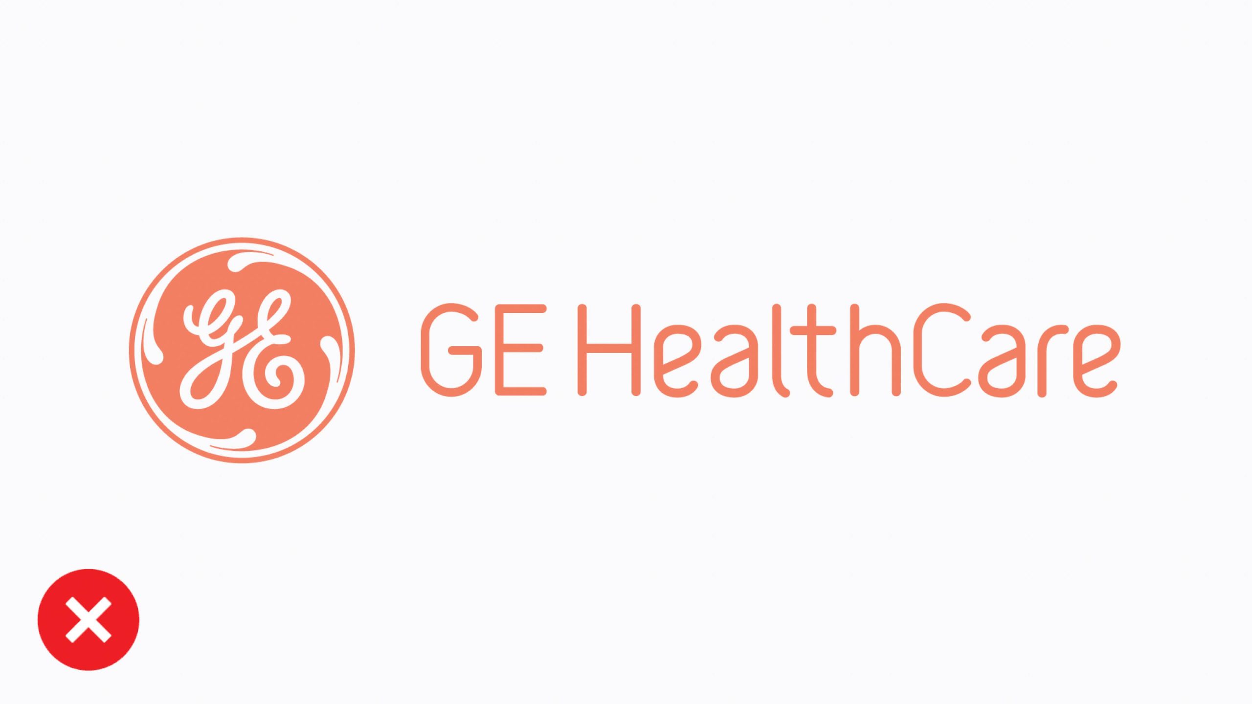
Don’t place Compassion Purple behind a white Monogram.
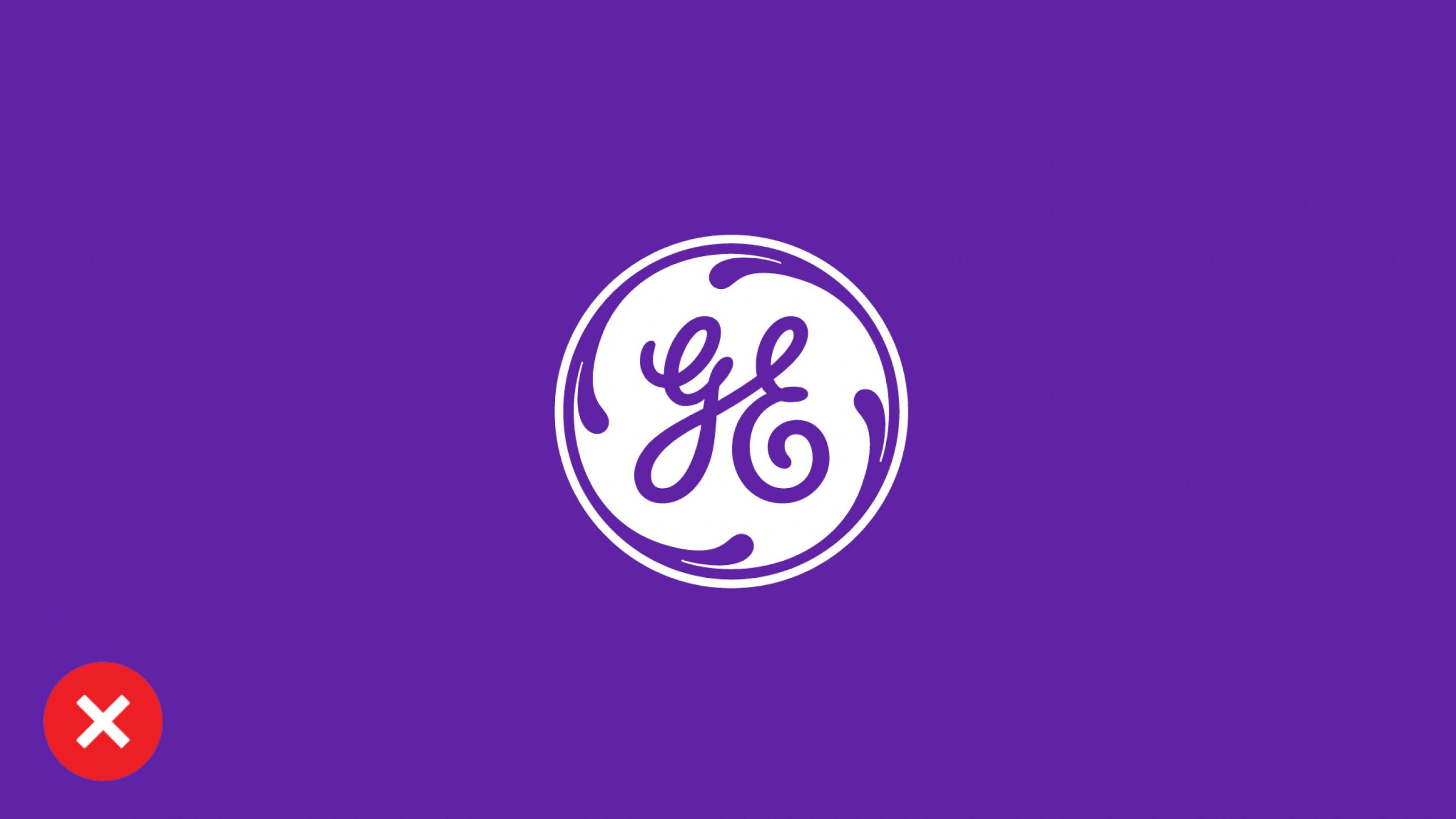
Don’t use the reverse Monogram in isolation on a Compassion Purple background. For social media or in limited space where using a Monogram is needed, always show the Monogram in Compassion Purple on white. Usage of theMonogram in isolation requires approval by GE HealthCare’s Brand Team.
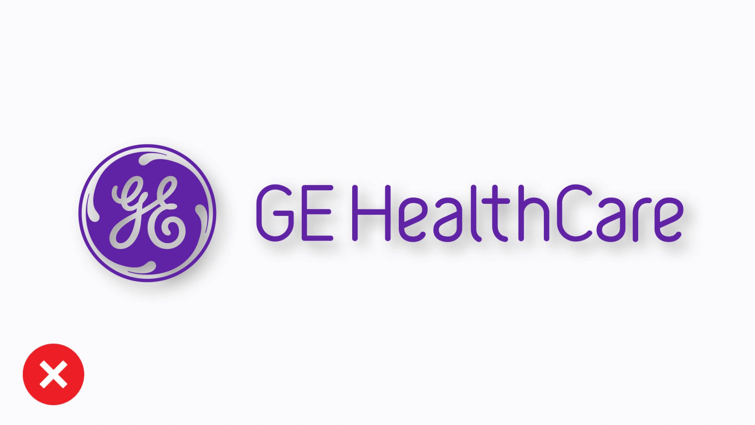
Don’t apply drop shadows or other effects to the logo.
GE HealthCare name
We continue to follow local regulatory requirements in our approach to branding. In most markets, use the English-language name “GE HealthCare.” Direct any questions about translating the “GE HealthCare” name to the brand team.
When referring to the brand, use “our brand” or “GE HealthCare’s brand,” not “GE HealthCare brand.” Avoid placing internal team, group or initiative names next to the GE HealthCare name or logo, as this may suggest a sub-brand.
The examples highlight recommended and discouraged uses of the logo and wordmark.
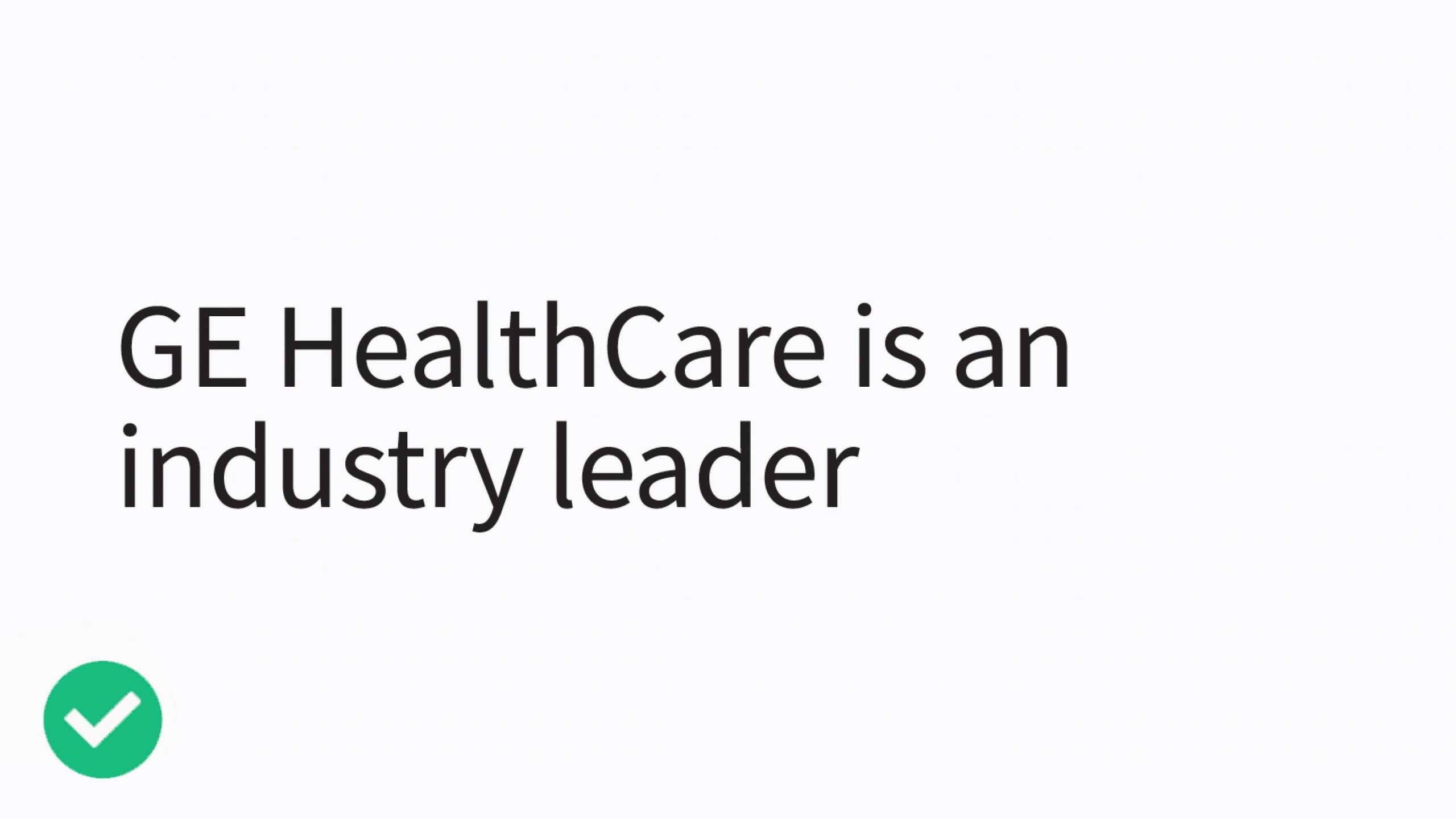
Do use the full business name to promote our new brand: “GE HealthCare is an industry leader.”

“GE” may not be used or referenced on its own (e.g., “GE is a leader in the healthcare space…”).
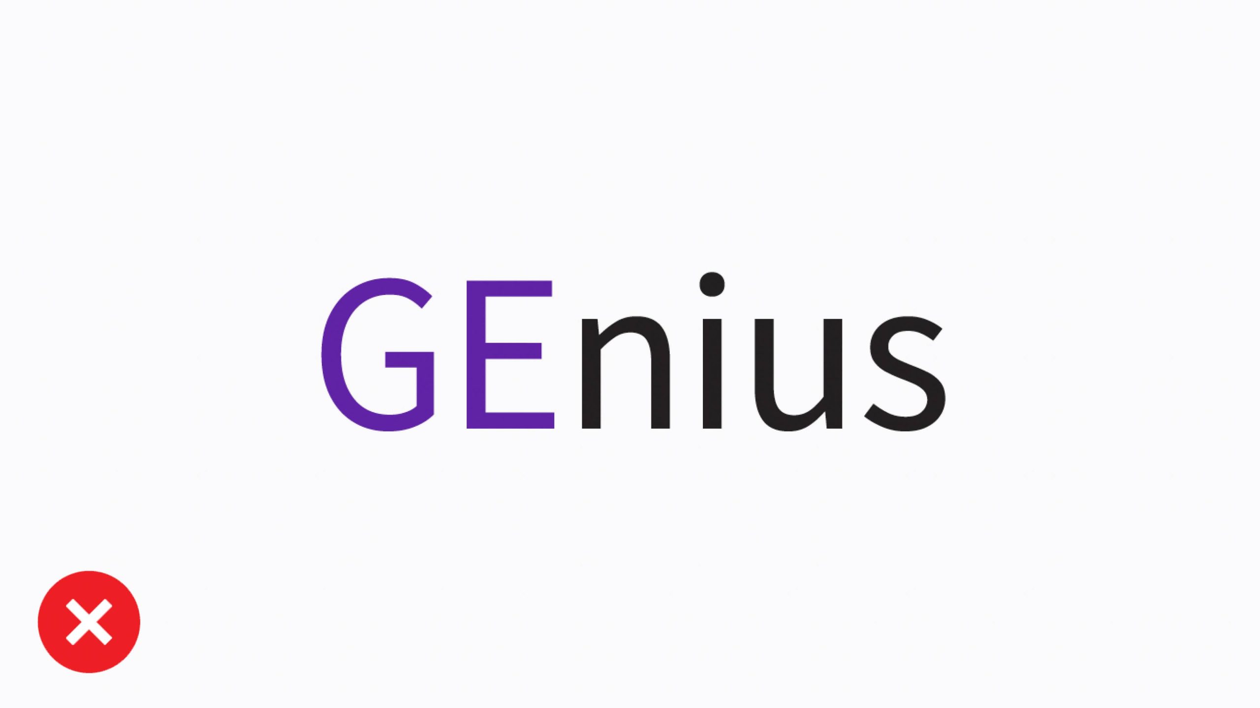
Do not use any secondary trademarks that emphasize “GE” and do not create new acronyms or initialisms that include “GE” (e.g., GEPDX).
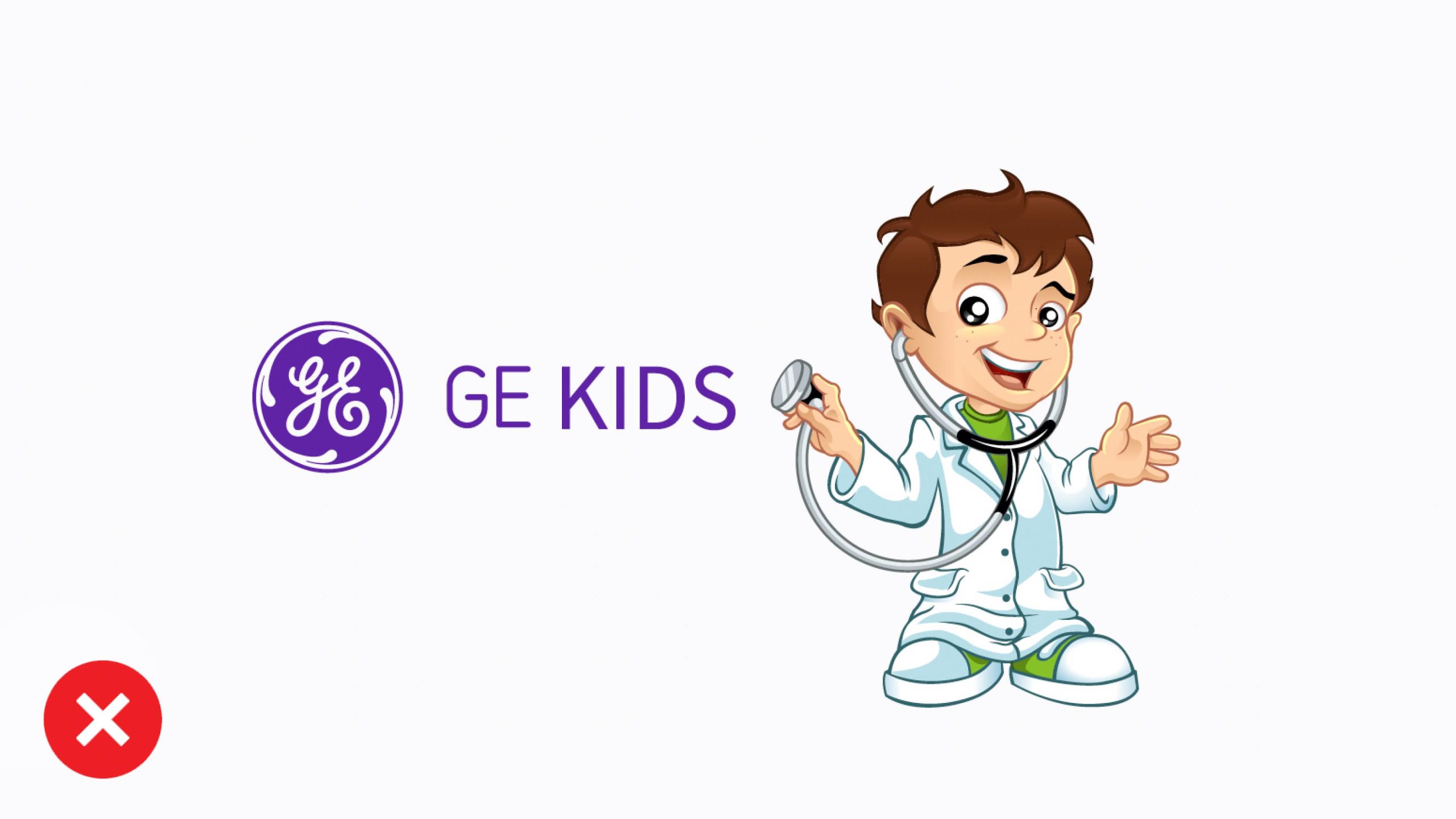
Do not create new logos, stylized wordmarks, typefaces, or mascots.
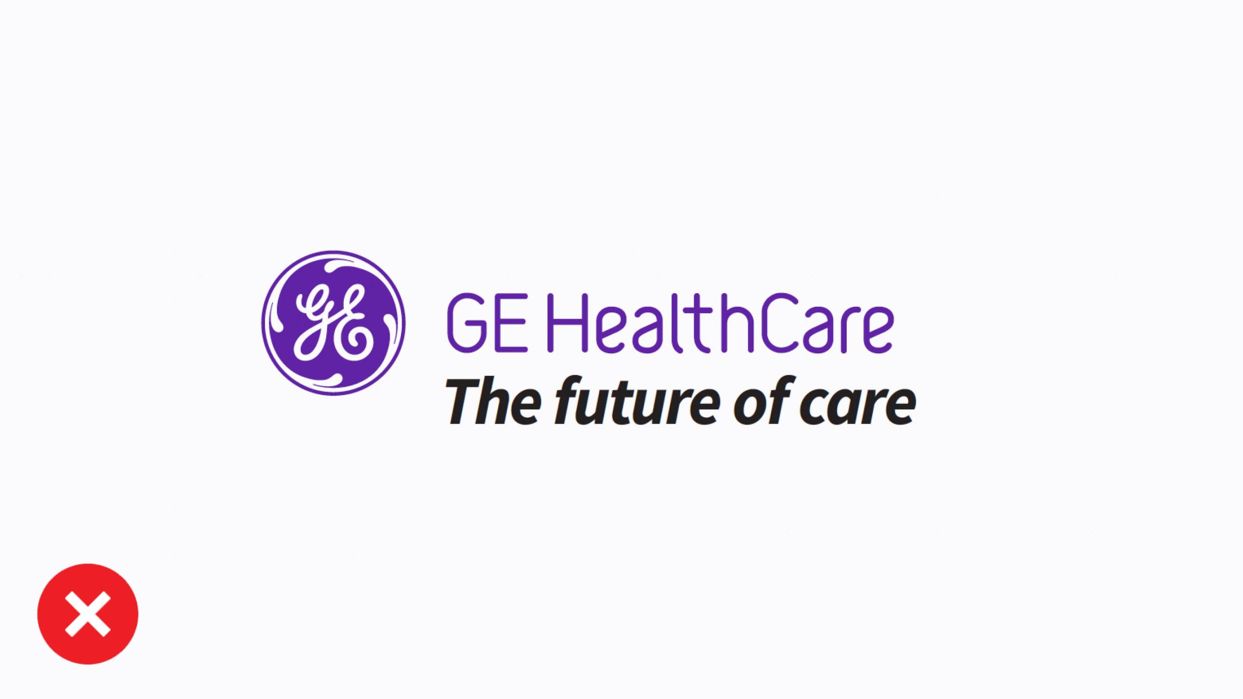
Do not create new taglines or lock up anything to the GE HealthCare logo.
Platform logo (special use)
The Platform logo is reserved for special advertising use cases. Use it to protect the integrity of the logo when placing it over busy photography.

Left-aligned

Right-aligned
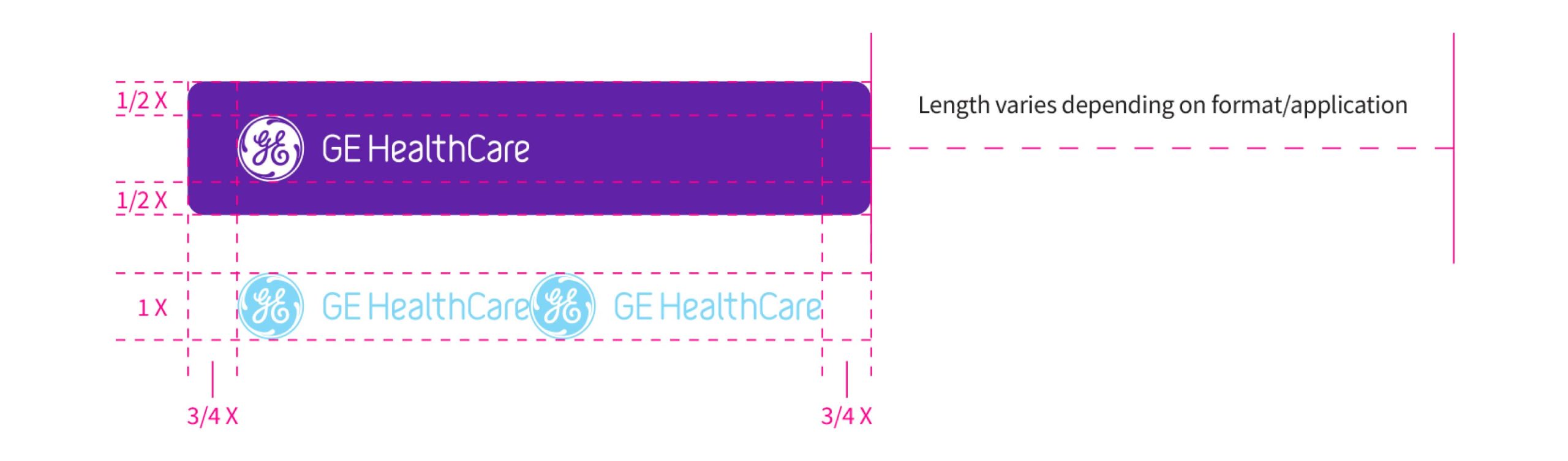
Shortest logo length
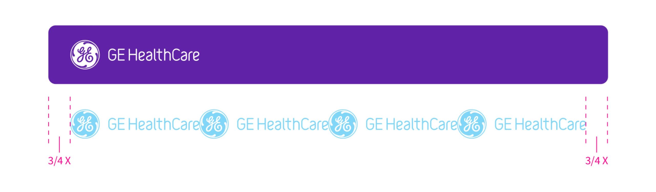
Longest logo length
The Platform logo is available in left-aligned and right-aligned versions for greater flexibility in composition. Use Platform logo assets as supplied, or extend the length to accommodate specific layout needs:
Minimum Platform logo length is the width of two logos with ¾ the height of the Monogram for clearance.
Maximum Platform logo length is the width of four logos with ¾ the height of the Monogram for clearance.
The height of the Platform logo should not be expanded or contracted. The proportion of GE HealthCare’s logo to the height of the Platform holding shape must always be maintained.
The clear space of GE HealthCare’s logo inside the Platform holding shape is ½ the height of the Monogram top and bottom, ¾ left and right.
Platform logo sizing and placement
Sizing
Set the height of the Platform logo to 150% of the document’s margin.
Placement
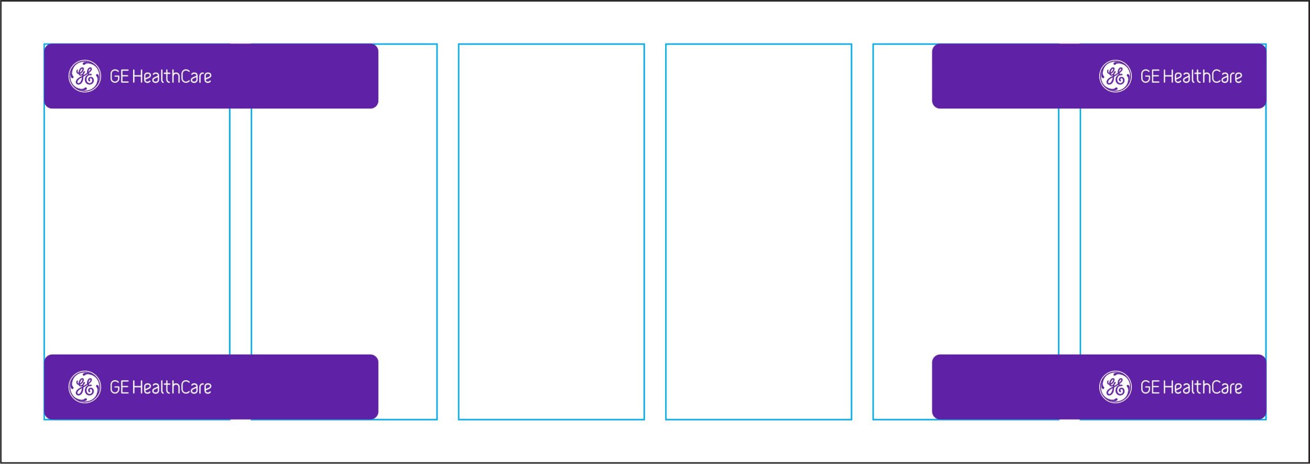
Place the Platform logo inside the margins in any of the four corners. Use left-aligned assets on the left and right-aligned assets on the right.
Length
In most applications, use the Platform logo at its shortest length. Expand the length as needed to maintain impact and legibility over busy photography.
Sizing
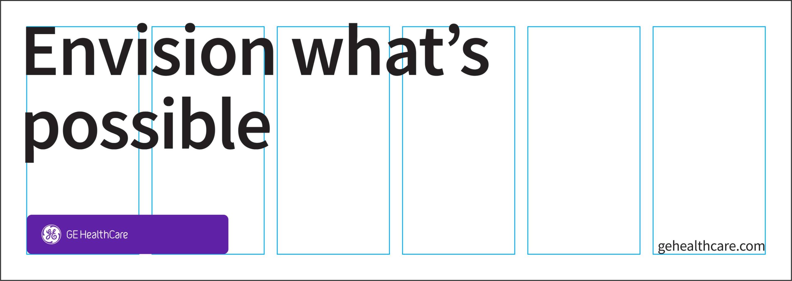
The height of the Platform logo is 150% of the document’s margin.
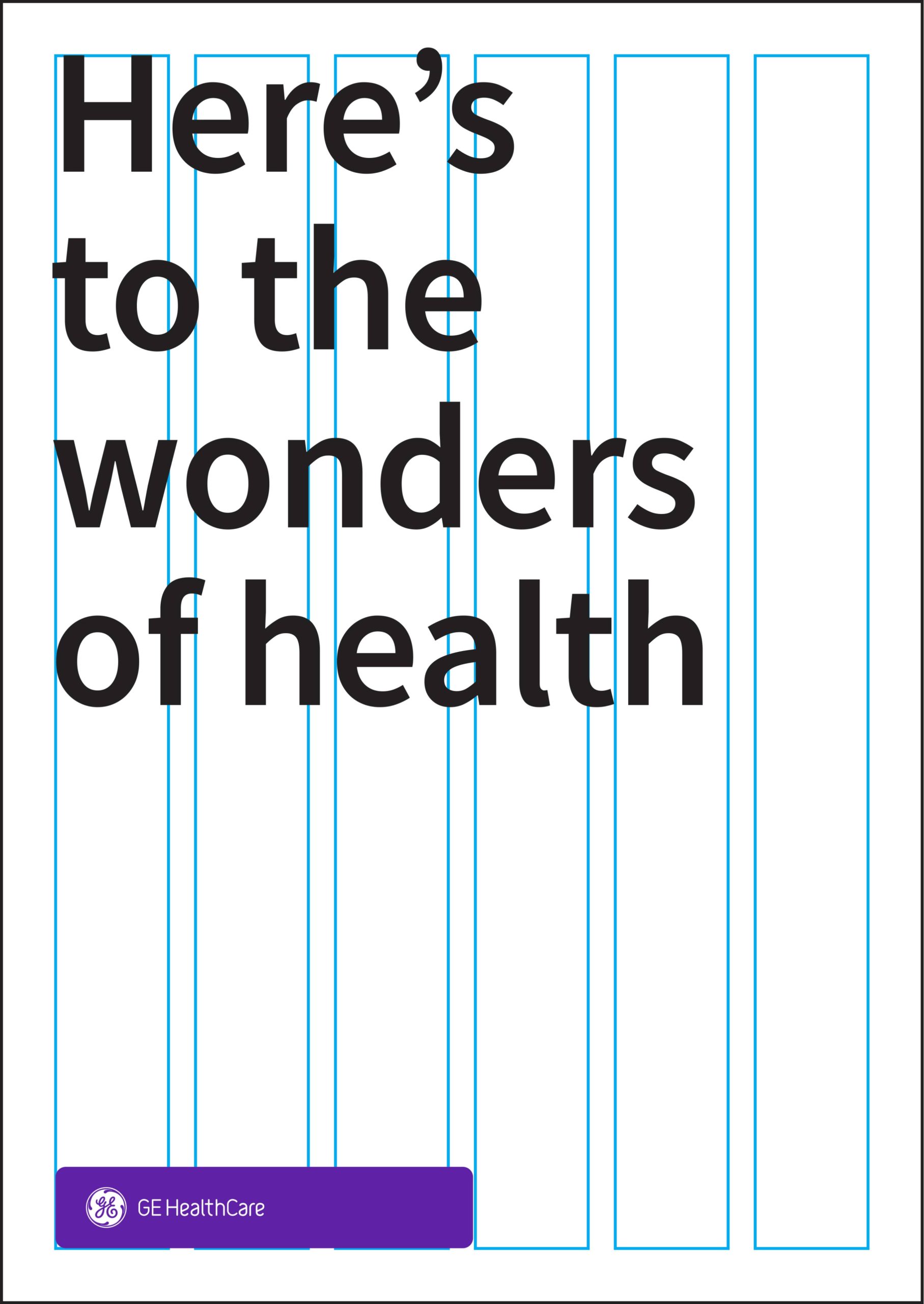
Placement
Platform logo don’ts
Using the Platform logo correctly is an important way to maintain brand consistency. Avoid the highlighted use cases.
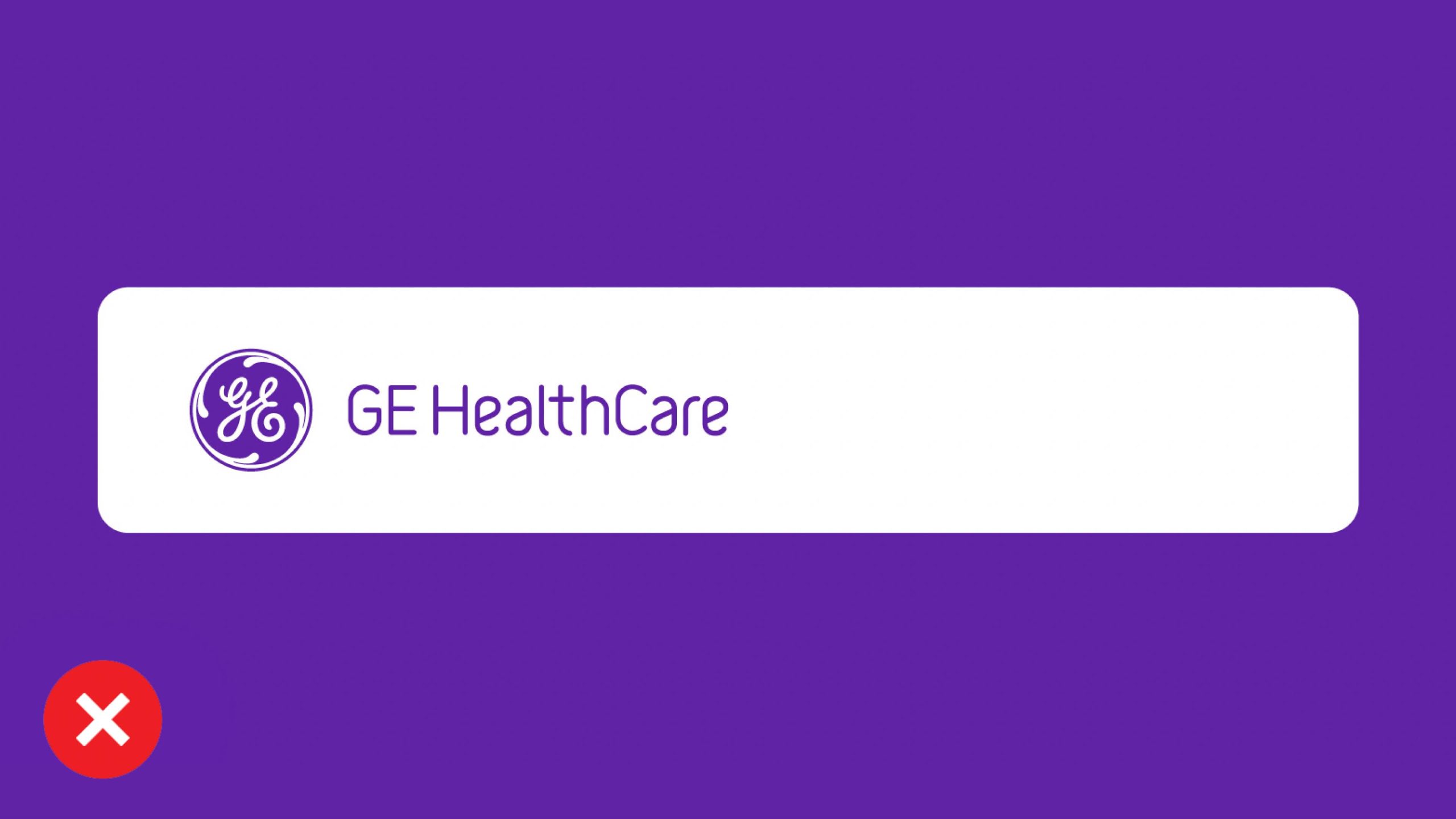
Don’t change the color of the Platform logo to white with Compassion Purple Monogram and wordmark.
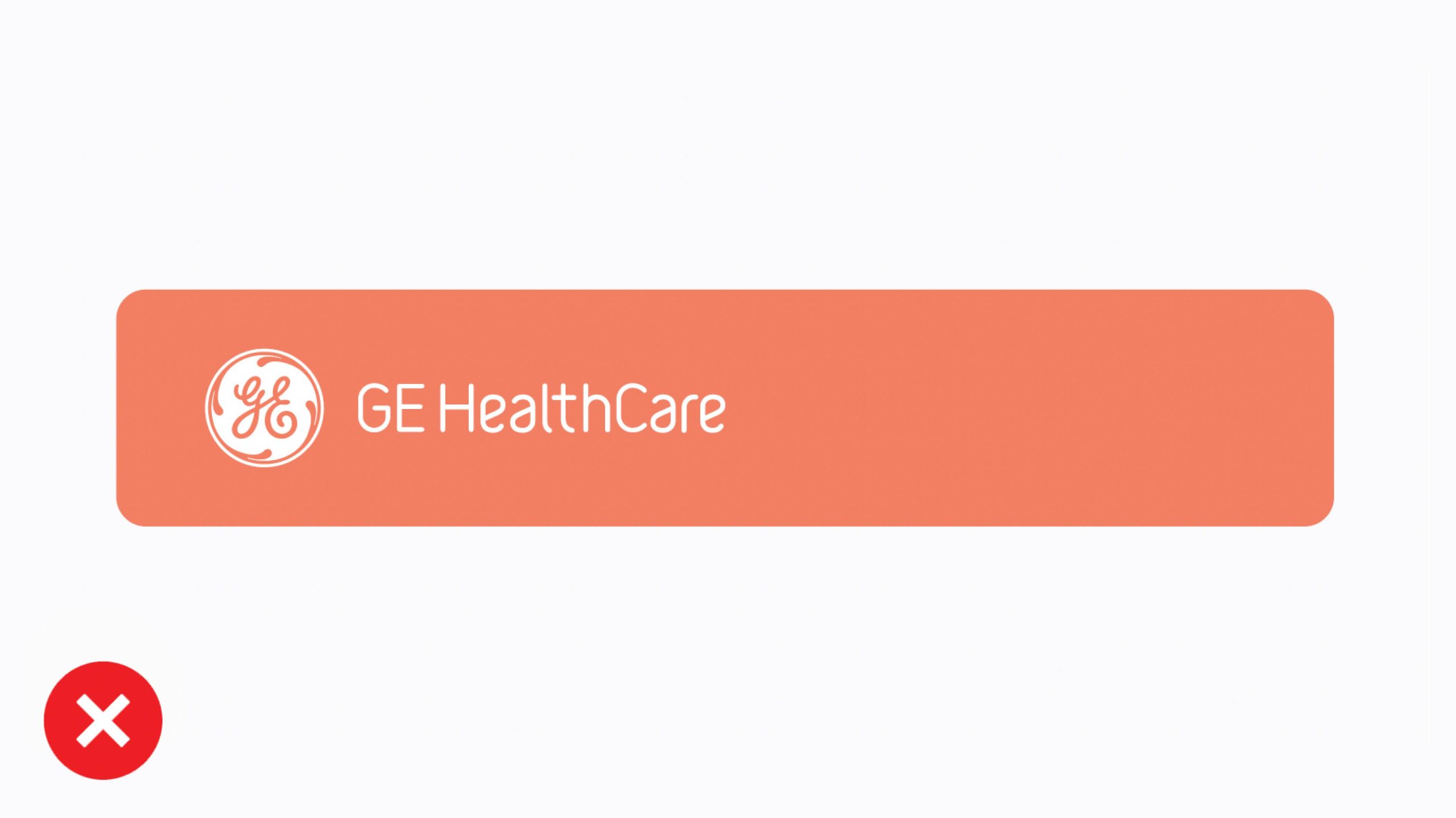
Don’t apply the accent color palette to the Platform logo.
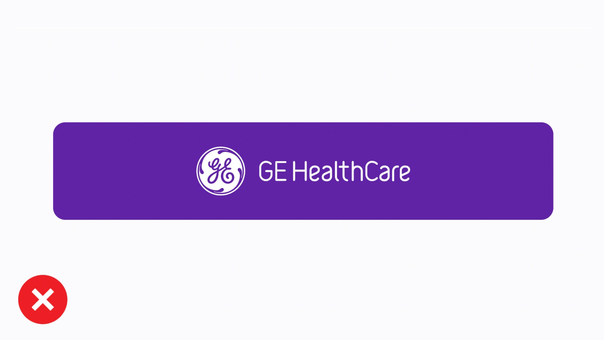
Don’t center the Monogram and wordmark inside the Platform logo.
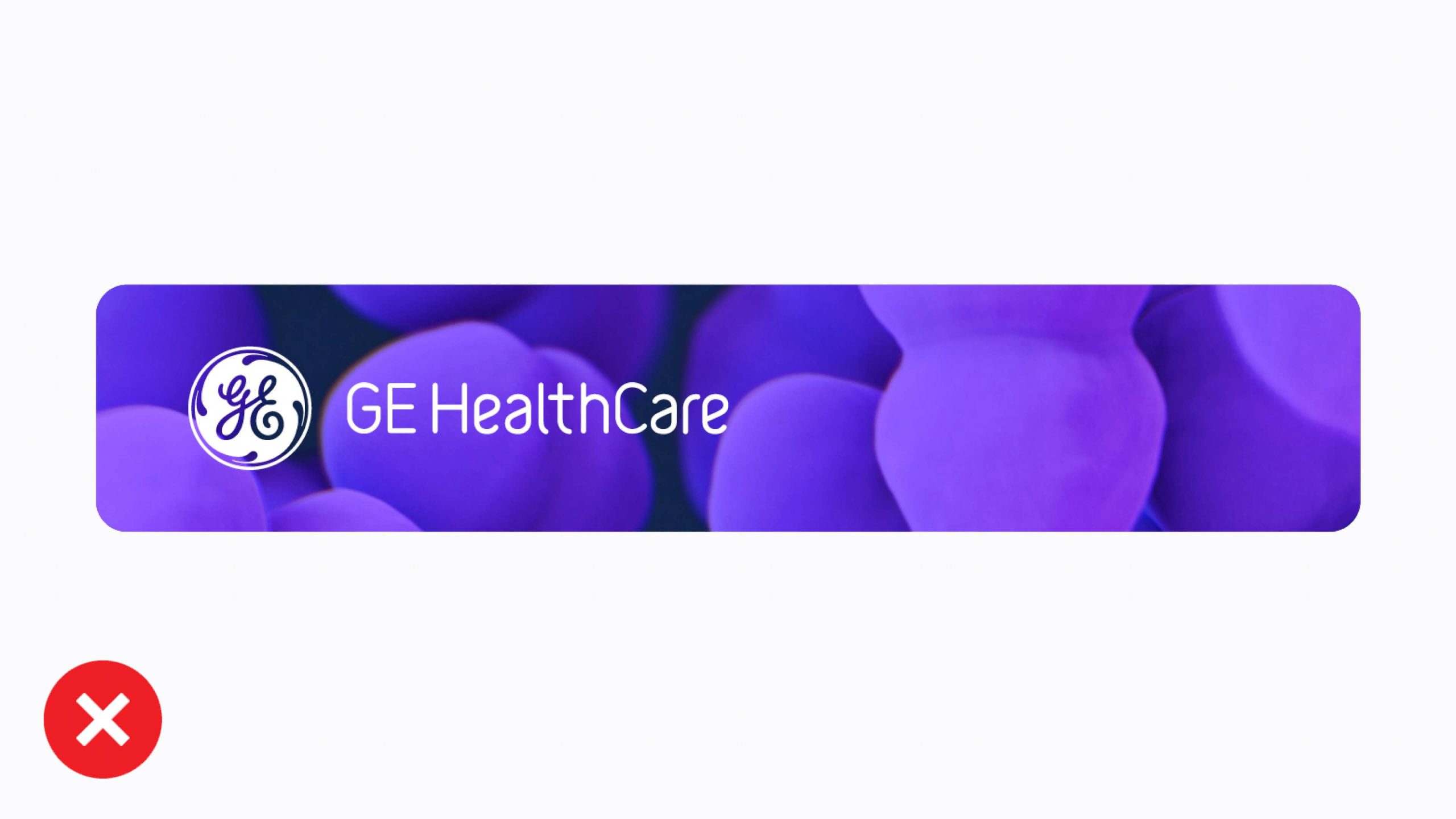
Don’t crop images inside the Platform logo.
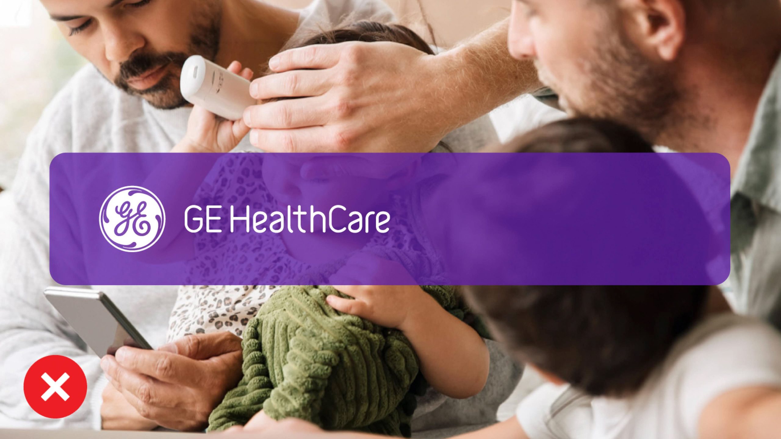
Don’t change the opacity of the Platform logo on top of imagery.
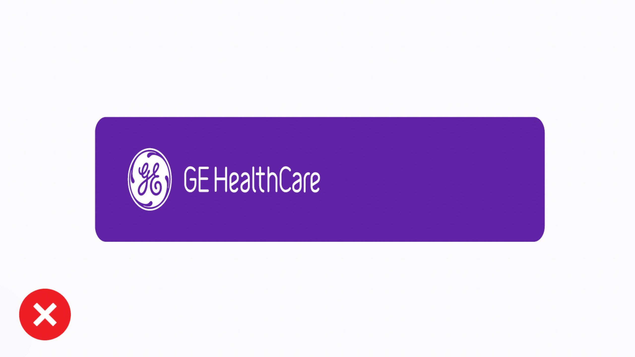
Don’t distort the Platform logo with horizontal compression.
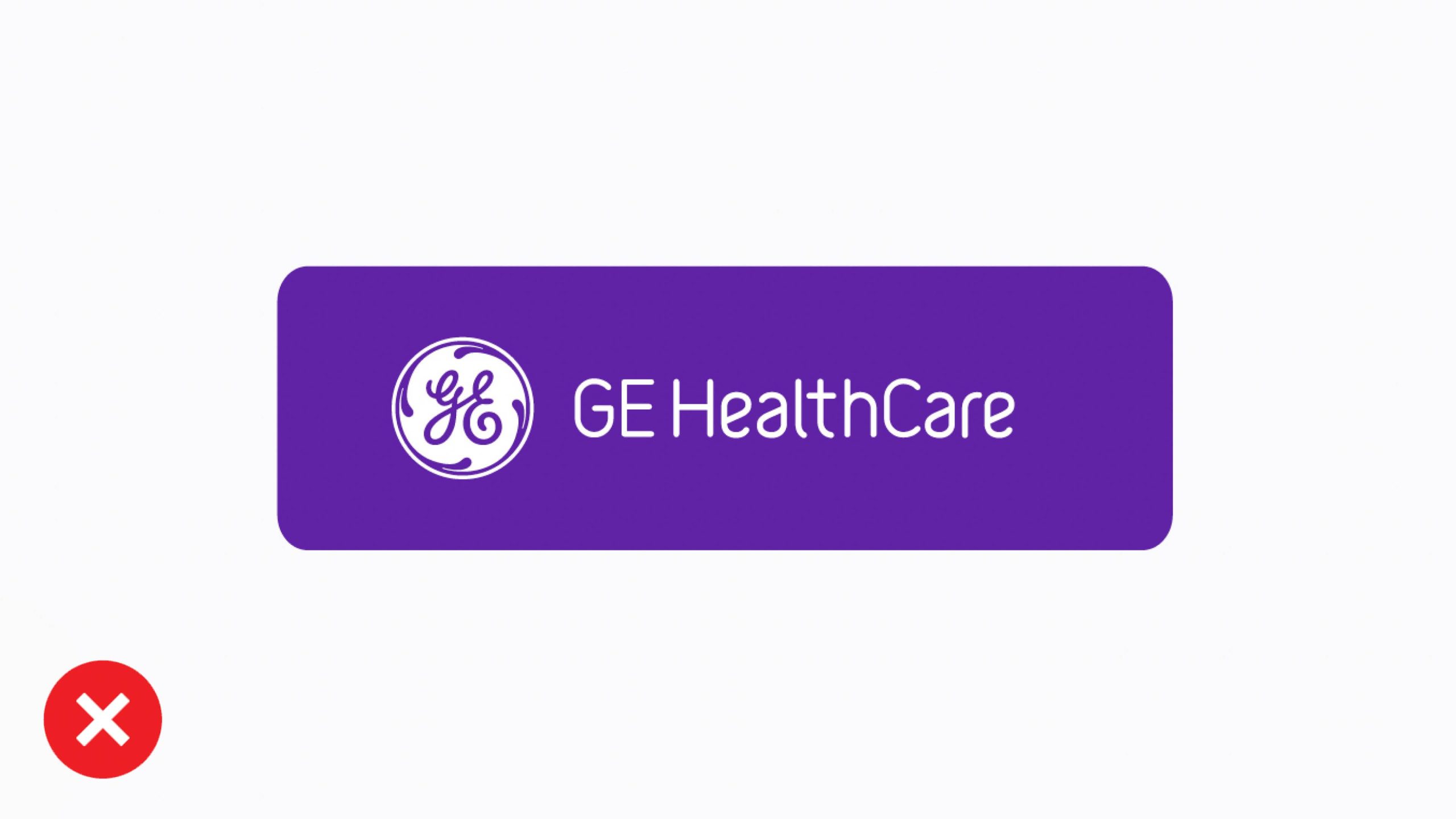
Don’t ignore the minimum Platform logo length.
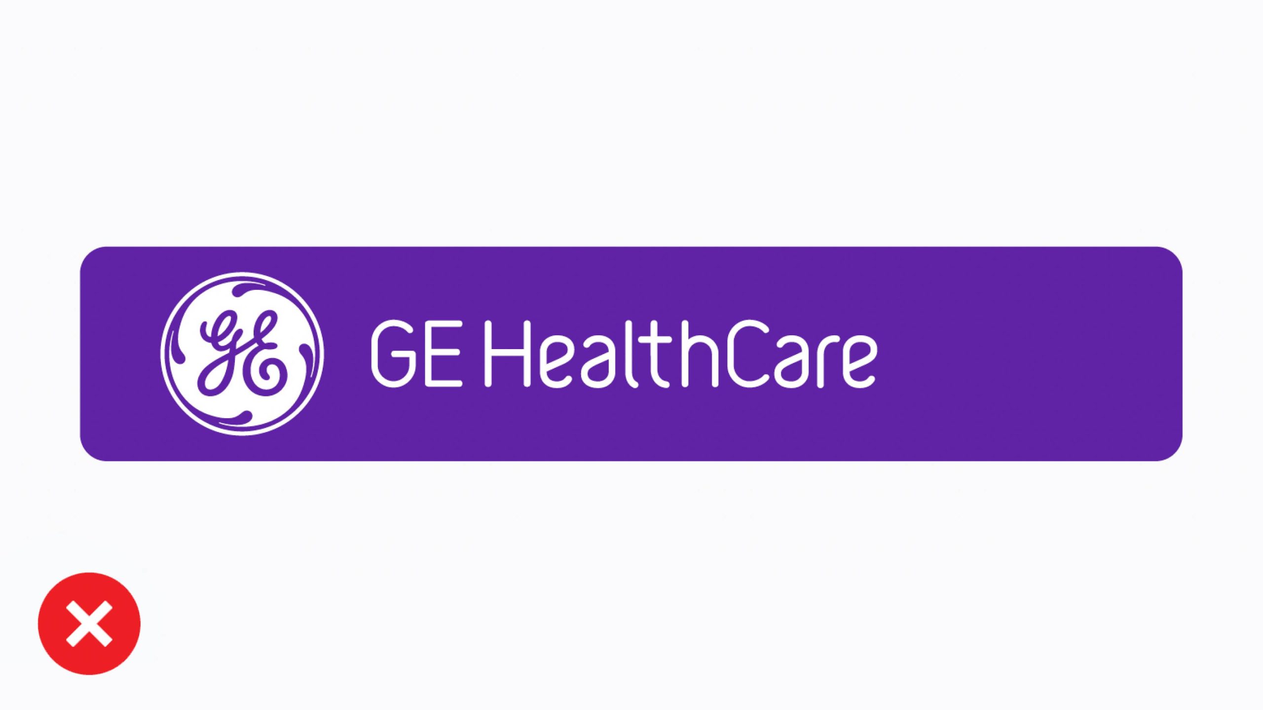
Don’t change the proportional sizing of GE HealthCare’s logo to the height of the Platform logo holding shape.
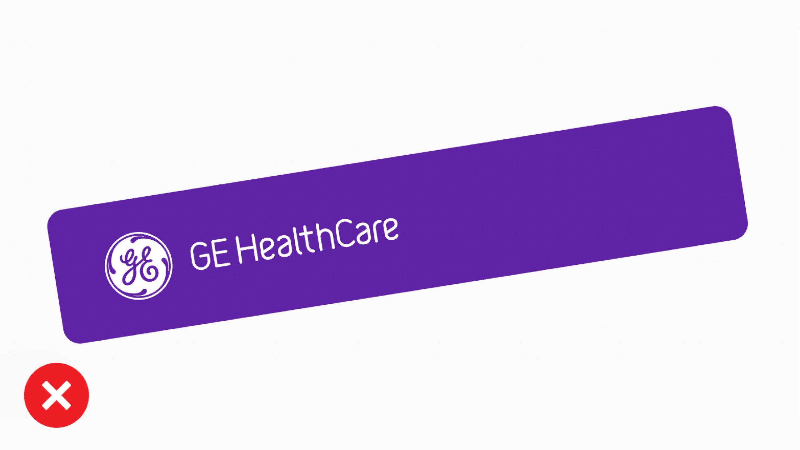
Don’t rotate the Platform logo.